A brand refresh for probably the best workout in CLT.
Good Work
Brand Strategy
Brand Identity
Stationery
Culture Kit
Merchandise Design
Licensing Collateral
Good People
Urban MVMNT, Charlotte NC
Owner: Stu Brauer
Clean it up. Make it consistent. Make it repeatable.
That was the plan for the brand refresh of Urban MVMNT, a microgym in Charlotte, North Carolina that lives in the whitespace in the middle of CrossFit and Orange Theory, F45, and Barry's Bootcamp.
While the brand was already well received by its audience and respected in the industry, owner Stu Brauer isn't the type to rest on his laurels. He contacted me to bring the best of Urban MVMNT together in a clear, authentic and consistent brand that would pave the way for future growth.
The strategy
With aspirations to License the Urban MVMNT model in the future, we had to be forward-thinking in our approach. We needed a brand that struck a chord with the millenial client avatar that sweats at Urban MVMNT while creating a look and feel that was repeatable and scalable.
Our approach was to take the best of Urban MVMNT, the slogans, the taglines and the vibe that the team had worked hard to cultivate, and build a strikingly simple brand around it.
New fonts = A new foundation for the brand
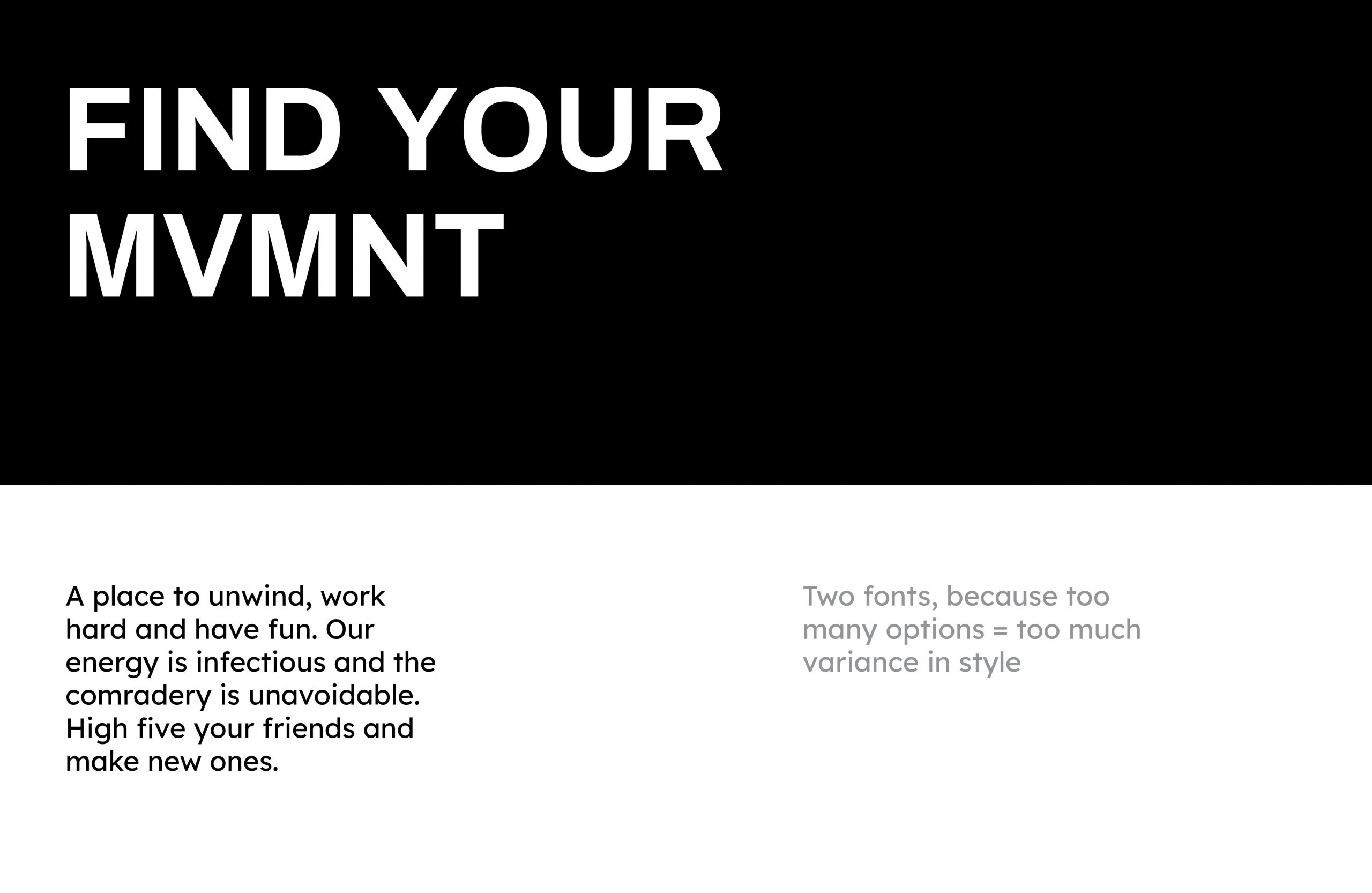
The previous font used by Urban MVMNT was a classic DIY font that was too common for a unique boutique brand. A bold new look for Urban MVMNT comes to life with two new fonts that blend premium and modern with a touch of fun.
New fonts = A new foundation for the brand
The previous font used by Urban MVMNT was a classic DIY font that was too common for a unique boutique brand. A bold new look for Urban MVMNT comes to life with two new fonts that blend premium and modern with a touch of fun.
A culture to be embraced
"We believe movement in all areas of life is essential, and that fitness should be an experience that’s fun and enjoyable. We’re the happy hour before happy hour, and that’s our MVMNT."
Stu and his team had built a place to workout for people who loved CLT and all its attractions, but who weren't hardcore fitness fanatics. They wanted to be in shape, meet other cool people, and go to a craft brewery afterward.
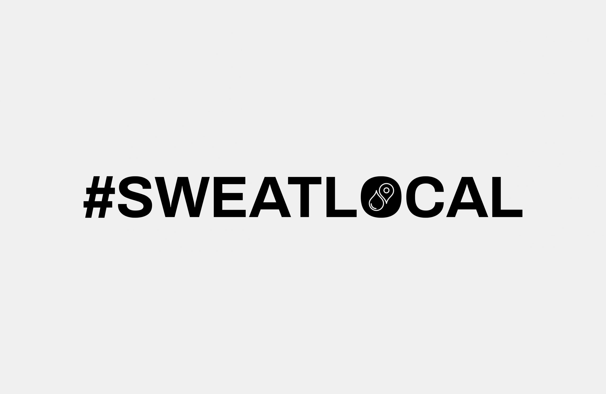
SWEATLOCAL and Probably the Best Workout in CLT were two taglines that were born before I became involved in the Urban MVMNT brand. I loved these taglines, but they weren't given the love they deserved, and I set about creating badges and iconography that would proudly be born by the fun + fitness crowd that Urban MVMNT serves.
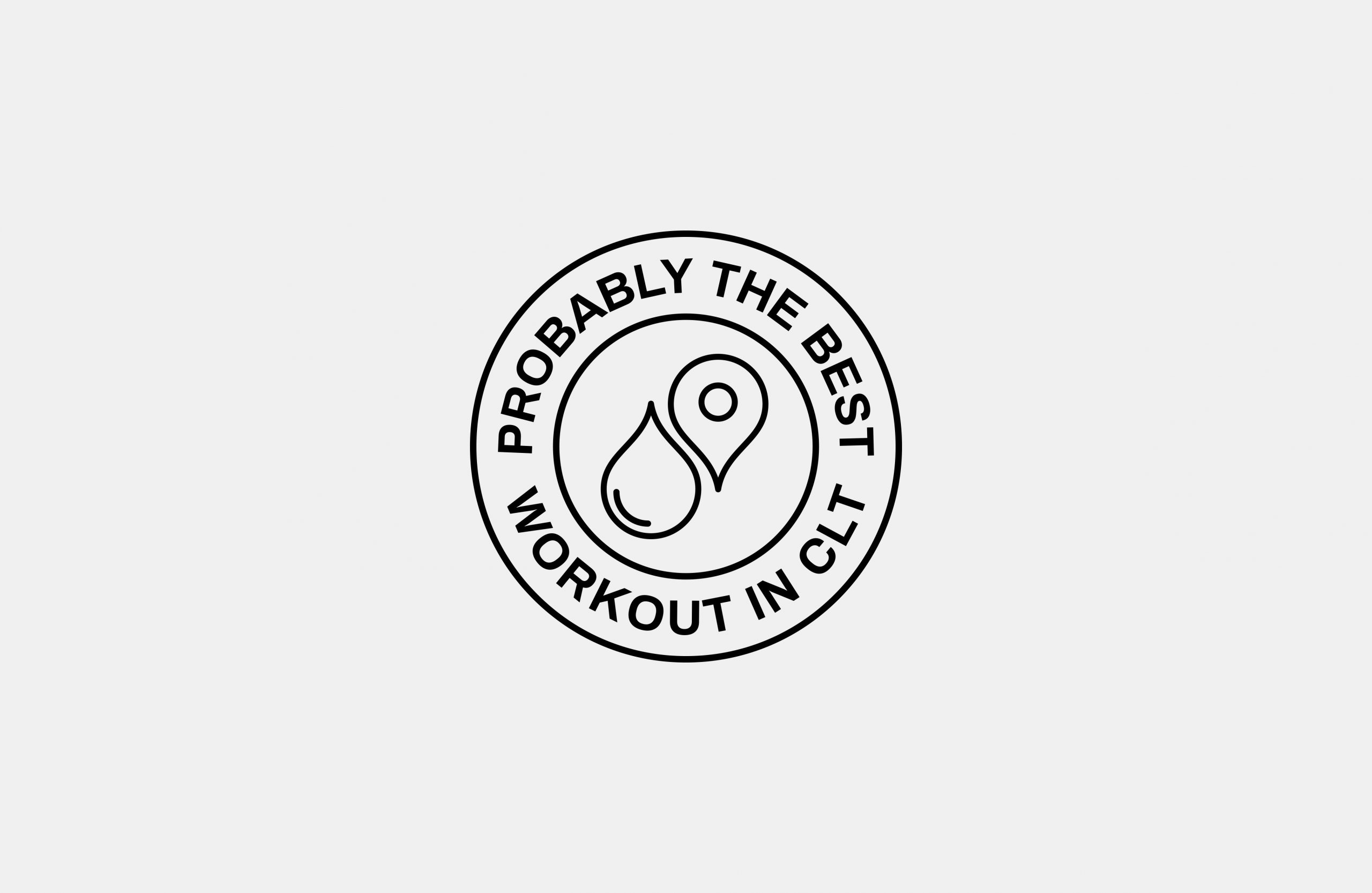
The sweatdrop and map marker invite people to make the connection between the brand and this icon, generating one of those 'aha' moments that people love.
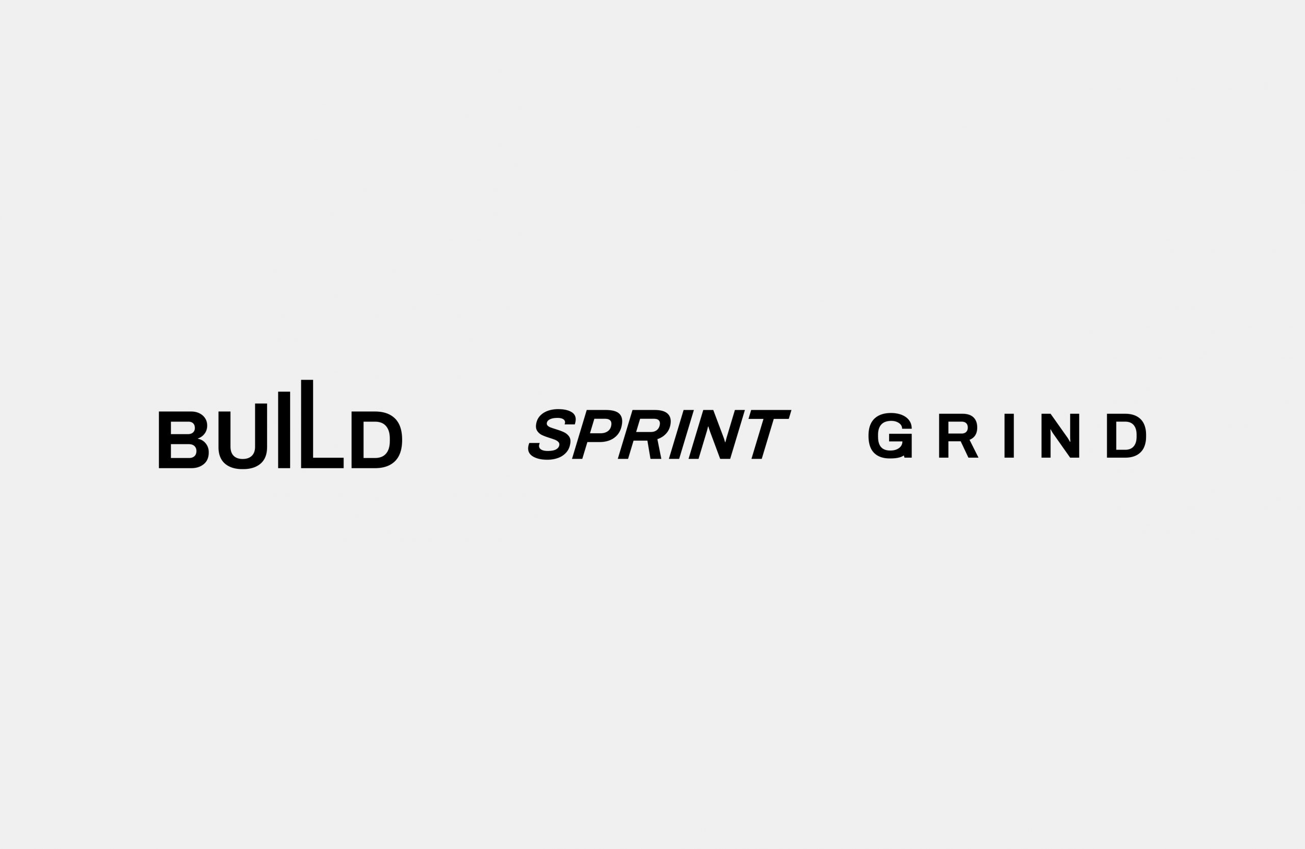
Urban MVMNT delivers tempo-based workouts at varying intensities, with each class serving a different dose of intensity and style of workout. Using the new brand font, we built a logotype for each class, using type to represent the character of each class.
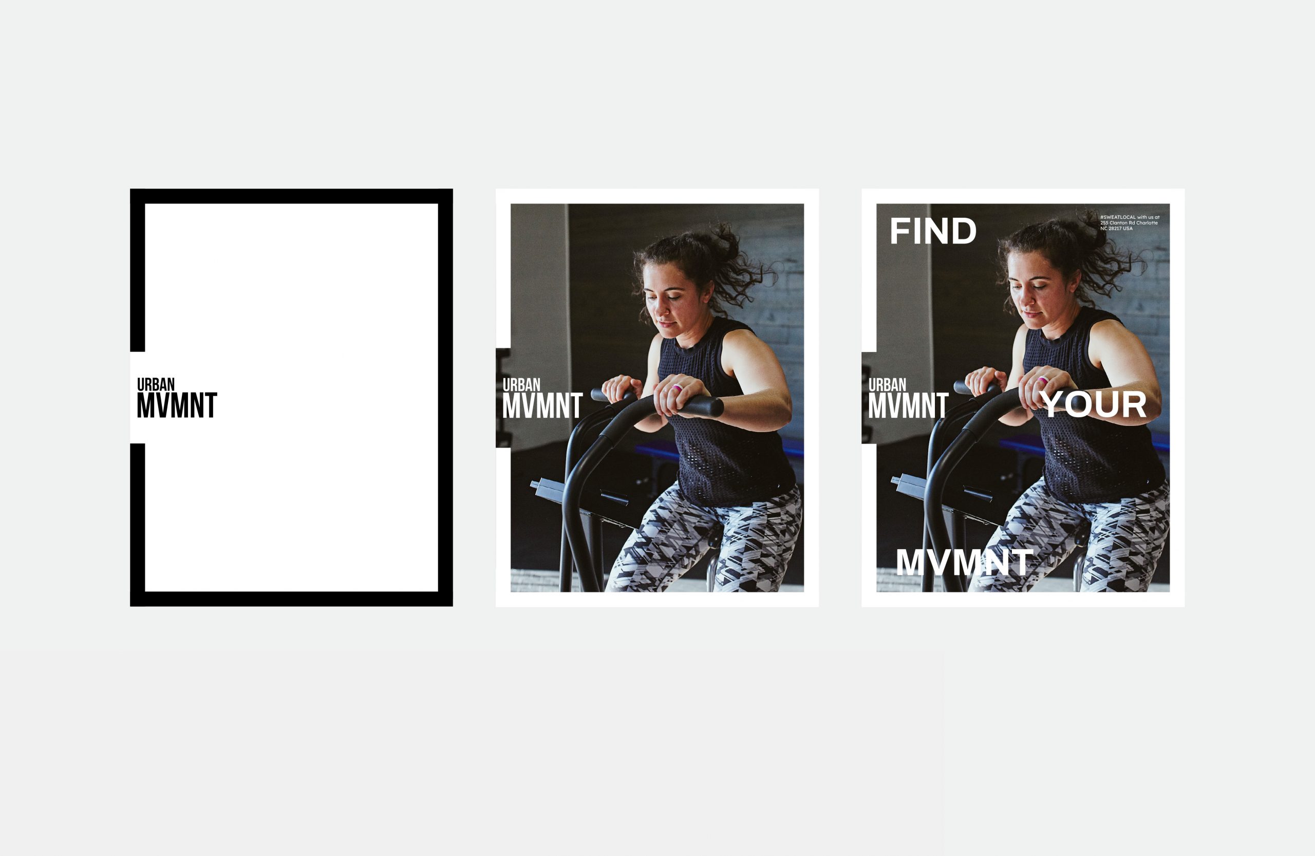
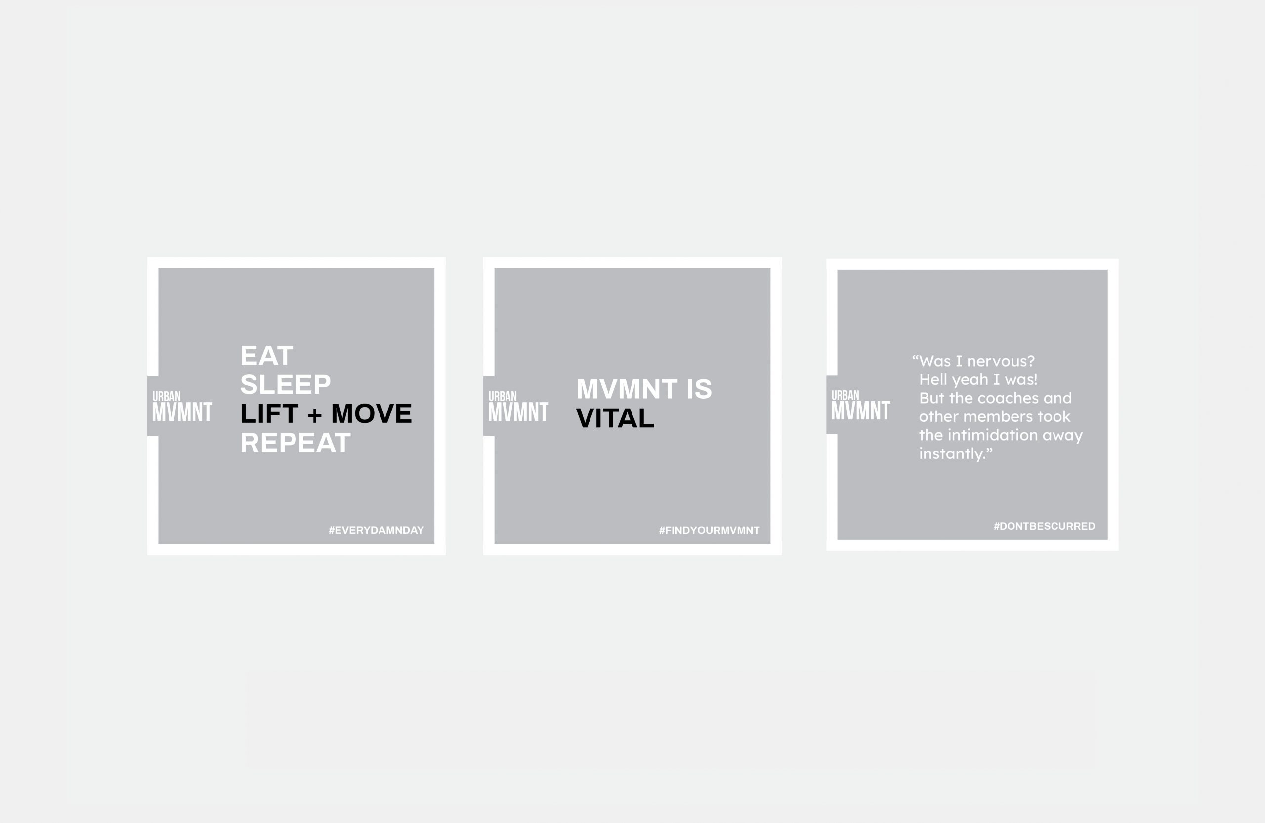
A layout system from print to digital
Building a brand that can be repeated for consistency requires more than just the right fonts and images, it requires a robust system for layouts to carry the look across print, merch, and online.
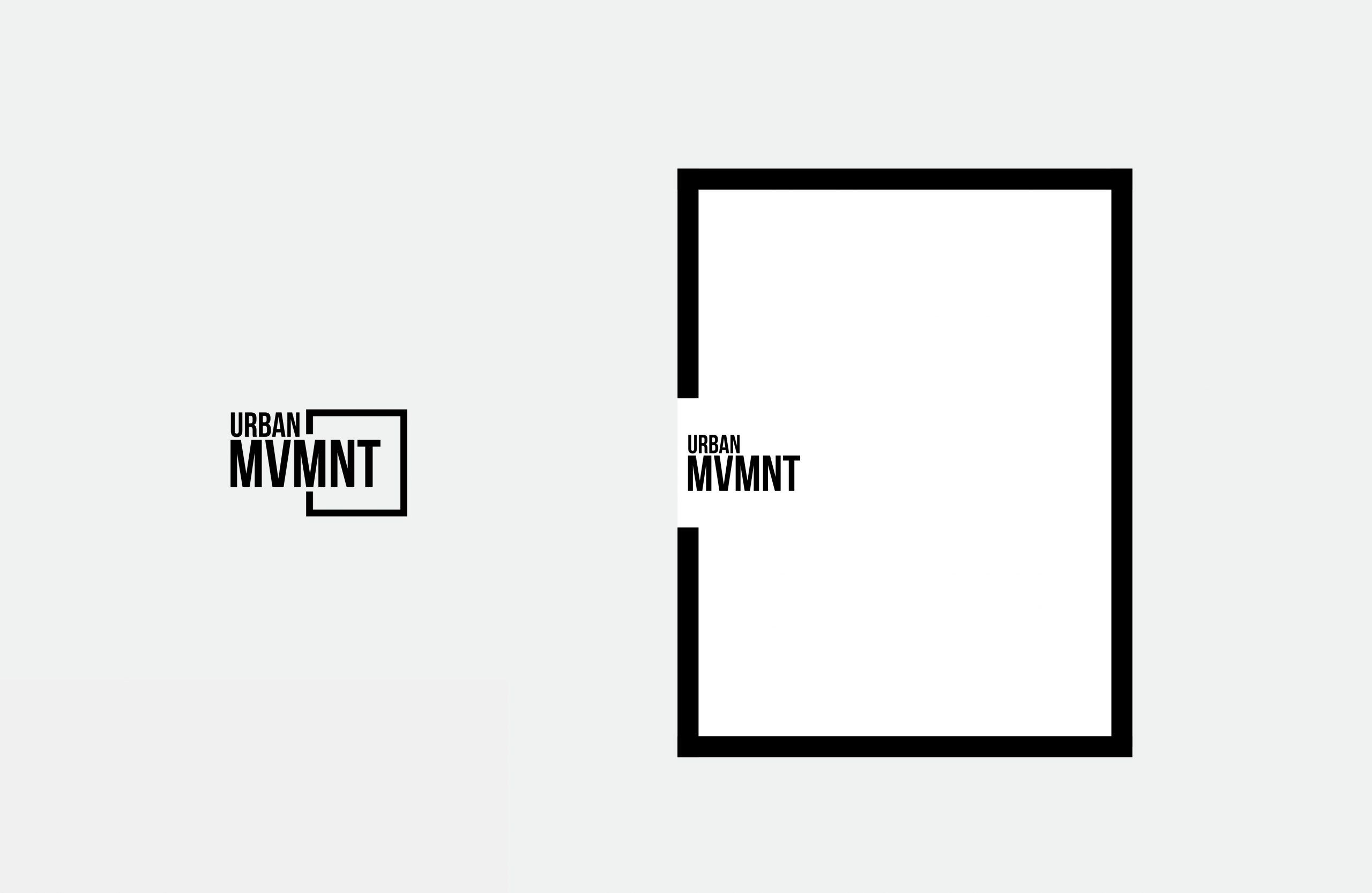
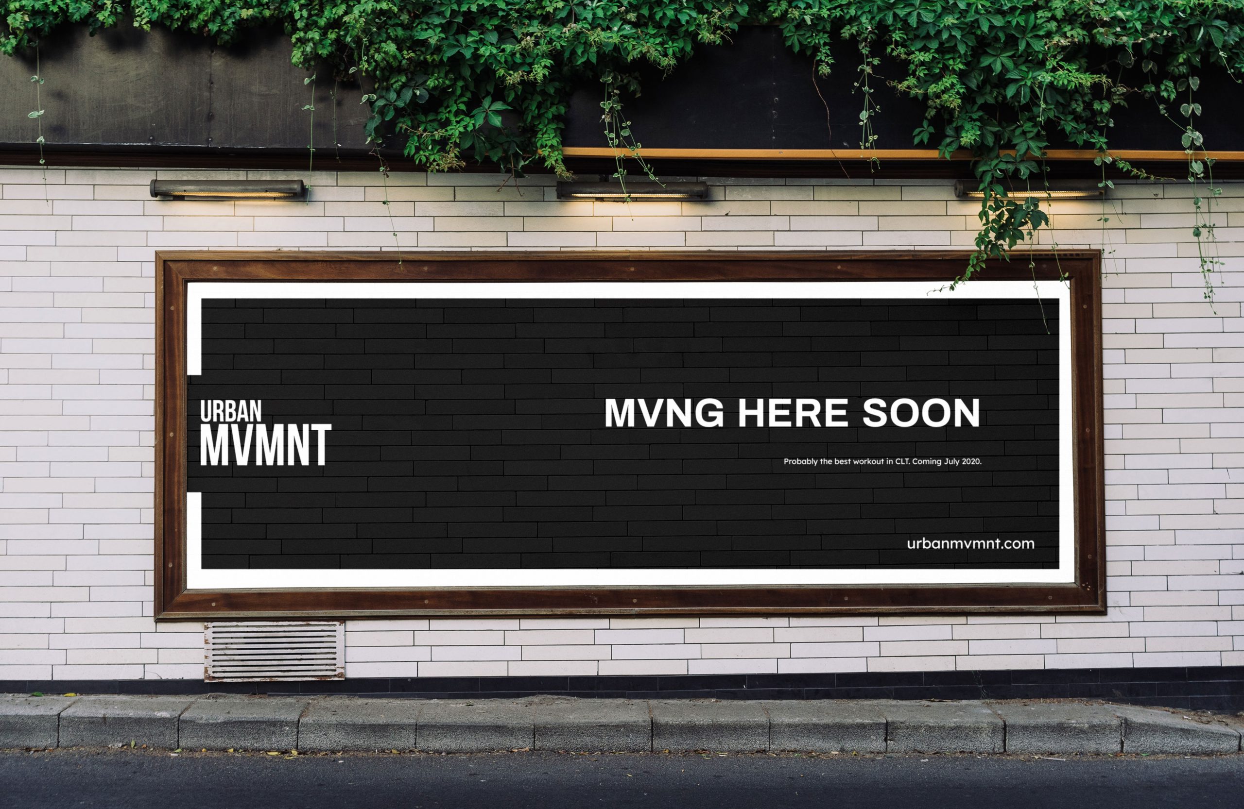
The box that surrounds the Urban MVMNT logo was blown up and used as a frame, adding versatility and bringing movement to the brand.
Bringing it to life online and in-class
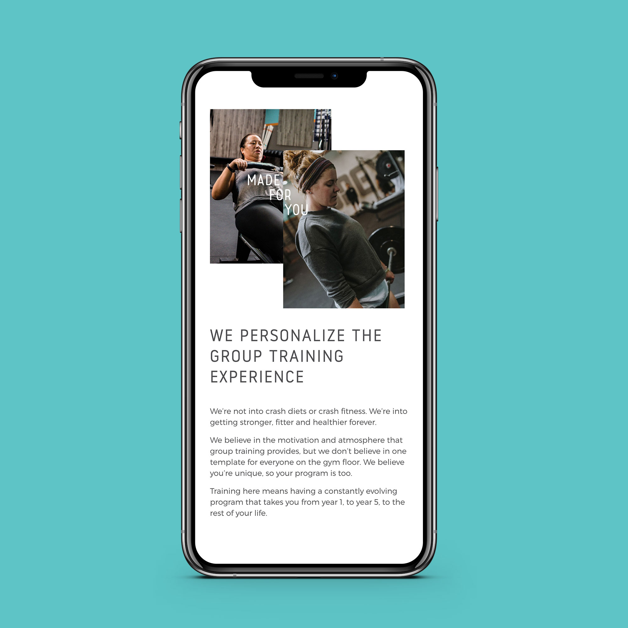
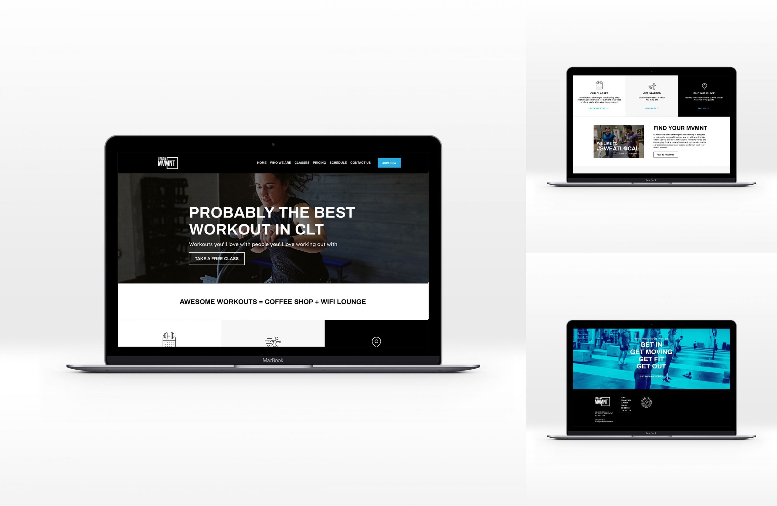
The website, built expertly by Flexx was next to get a facelift with the new brand. The new fonts, new layout system, and colours were applied to the site, bringing the digital in line with the physical.
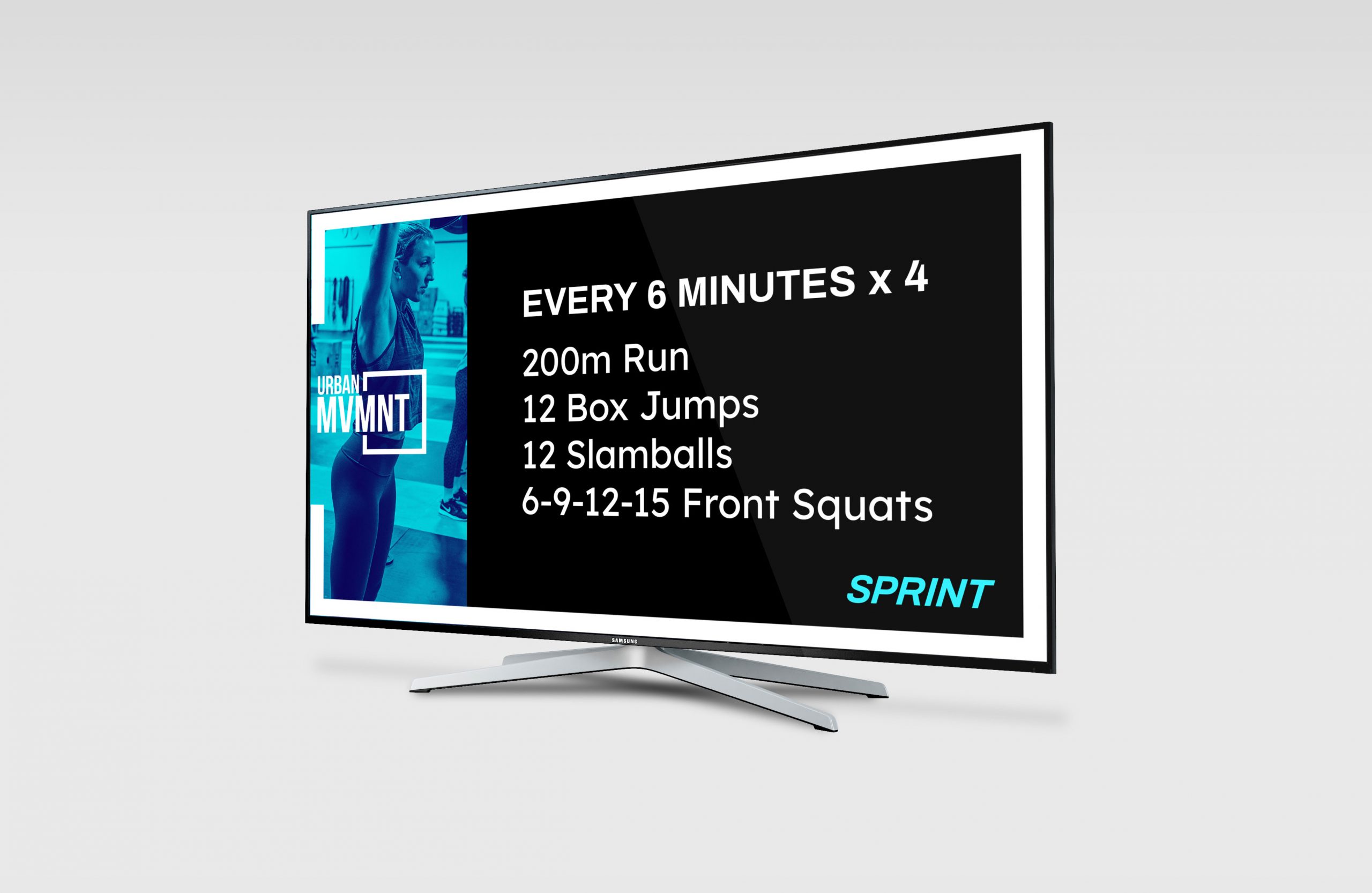
The TV's inside the facility were also given an upgrade, ensuring that wherever prospects and clients experience the brand, they're served the same Urban MVMNT vibe.
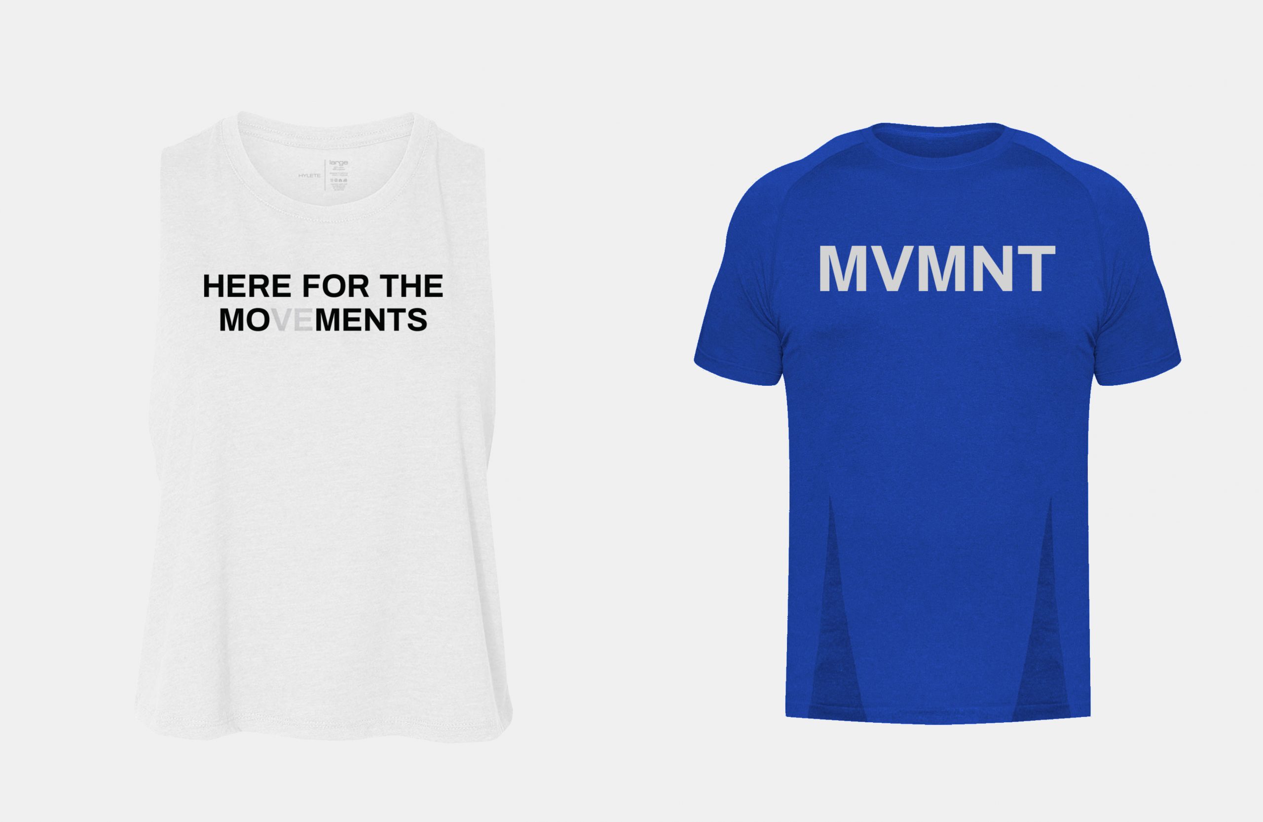
Merch that members actually love to wear
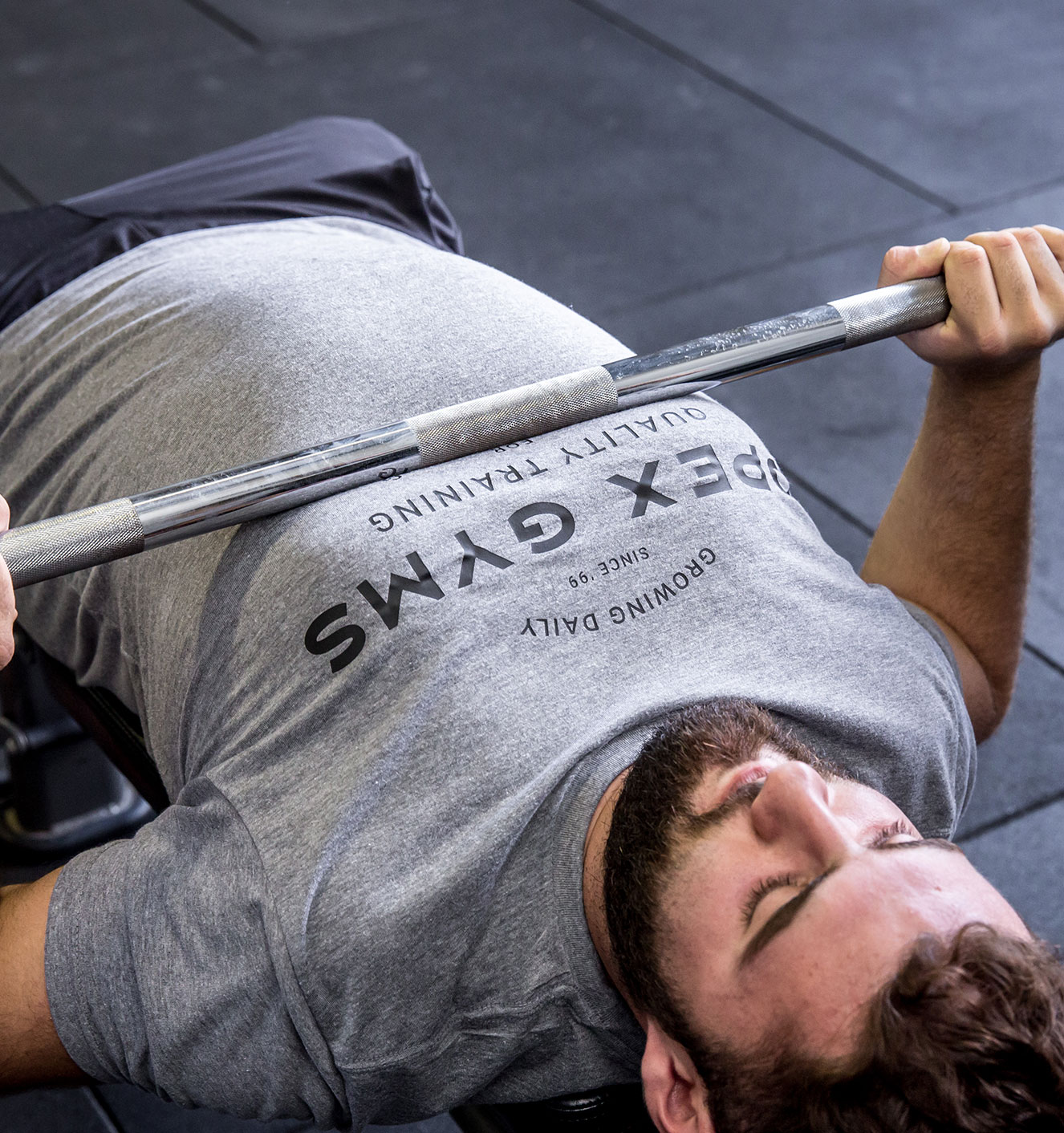
To create clothing that people want to wear (and that sells really well), we took a minimalist approach, creating shirts and tanks that people could wear outside the gym on their rest day.
Merch that members actually love to wear
To create clothing that people want to wear (and that sells really well), we took a minimalist approach, creating shirts and tanks that people could wear outside the gym on their rest day.
Getting ready for the License play
Stu had a plan to bring Urban MVMNT out of Charlotte and to every major city in the US. This was the catalyst for this brand evolution, and the reason it was designed to scale. In 2021, the Urban MVMNT license is a reality, and along with the immersive business coaching provided by HQ, licensees also gain an engaging, clear, authentic brand to call their own.
More good work for good people
