A brand that captures the essence of a vibrant community
Client
OPEX KURA
Tangible results are non-negotiable at this boutique gym in San Mateo, California
Goals
Rebrand from KURA Strength to OPEX KURA without losing the magic that makes people love and live the KURA life
We created
Brand Identity
Culture Kit
Client Appreciation Pack
Gym Signage
Merchandise Design
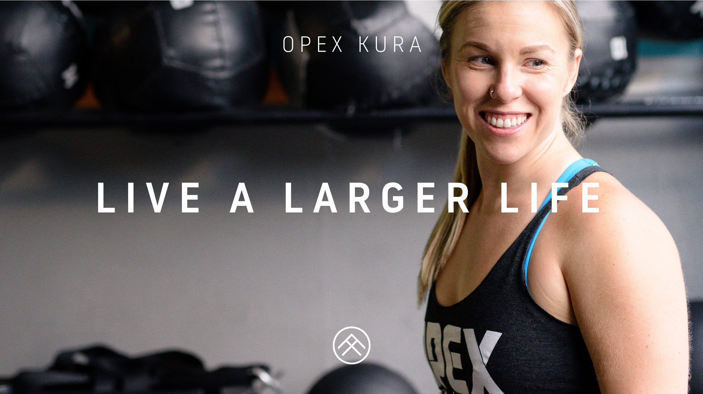
Cali vibes, results for everyone and a place to belong
Evolve or die. That was the owner Melissa’s reason for rebranding, something her coach had drilled into her mind and told me everything I needed to know.
As one of the original OPEX Gyms for close to 3 years, Melissa felt that the time was right to take on the OPEX name and evolve past KURA Strength.
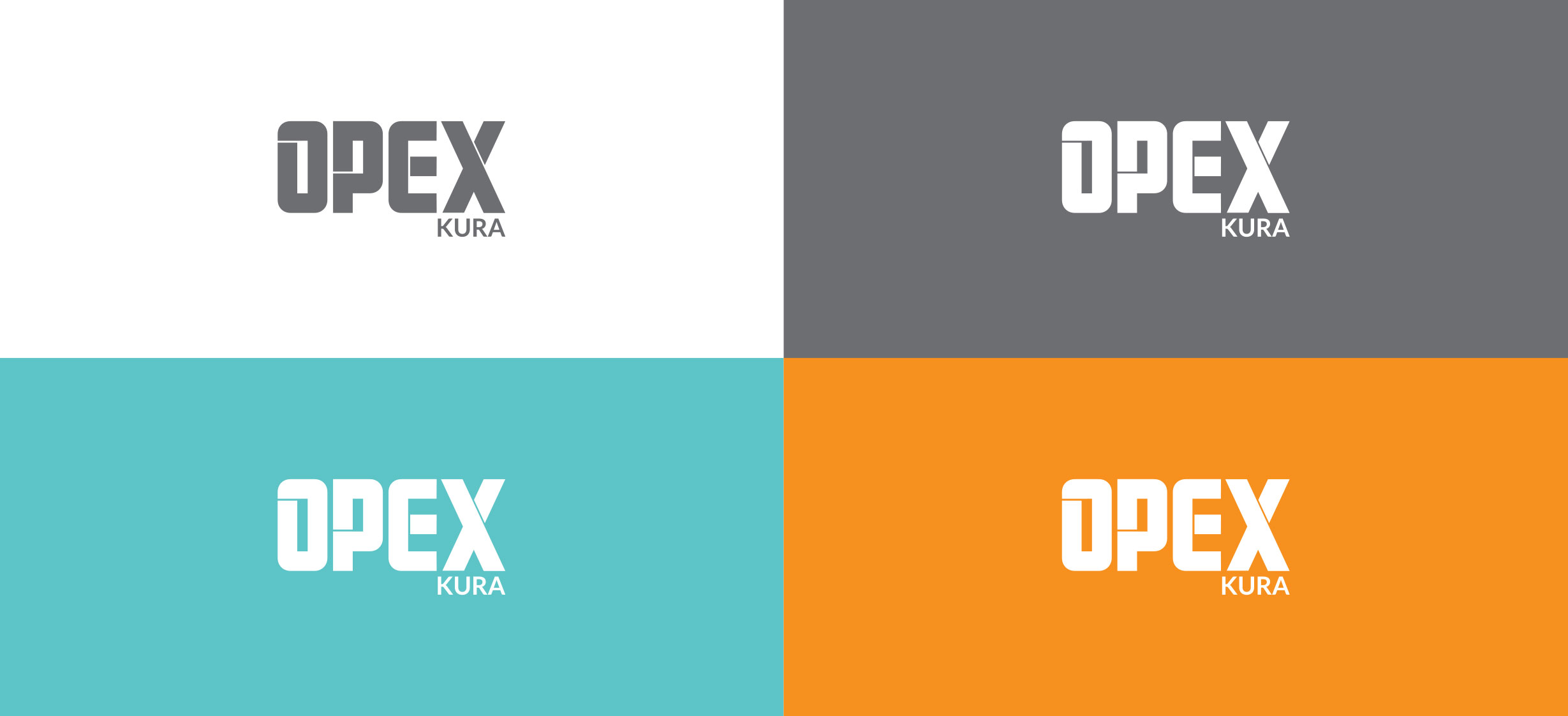
While the logo was set by OPEX, the rest of the brand was free to follow the vibe of the gym. Melissa had worked hard to build an authentic voice for the gym, and it was my job to bring it life in her brand.
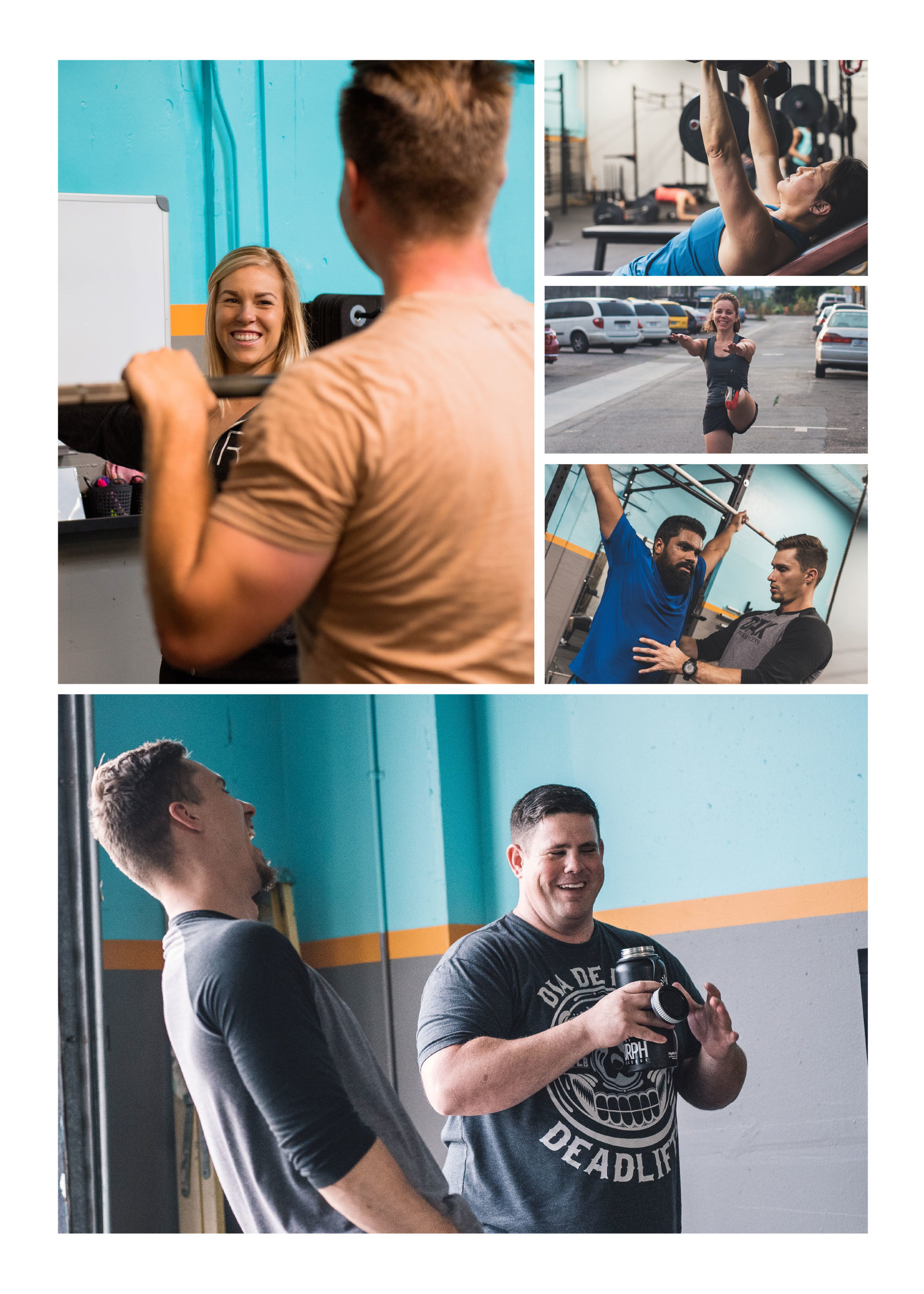
My task was to take everything about KURA, the space, the people, the energy and create a visual representation that would connect to people’s hearts.
Breathing new life into the gym
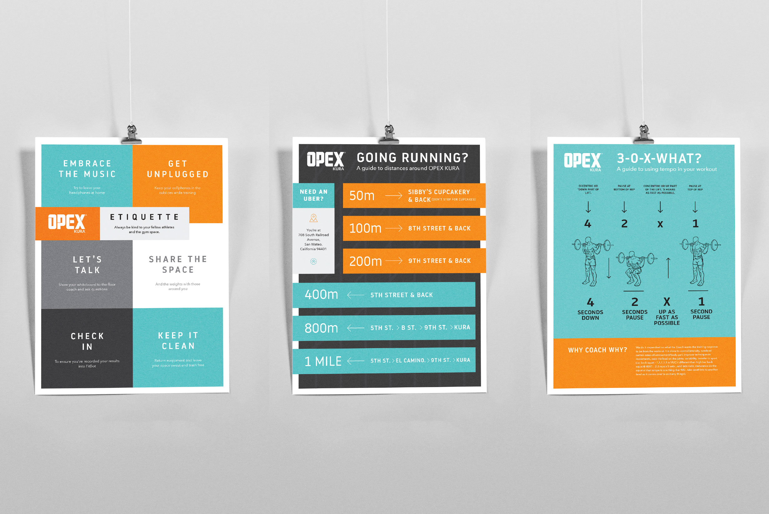
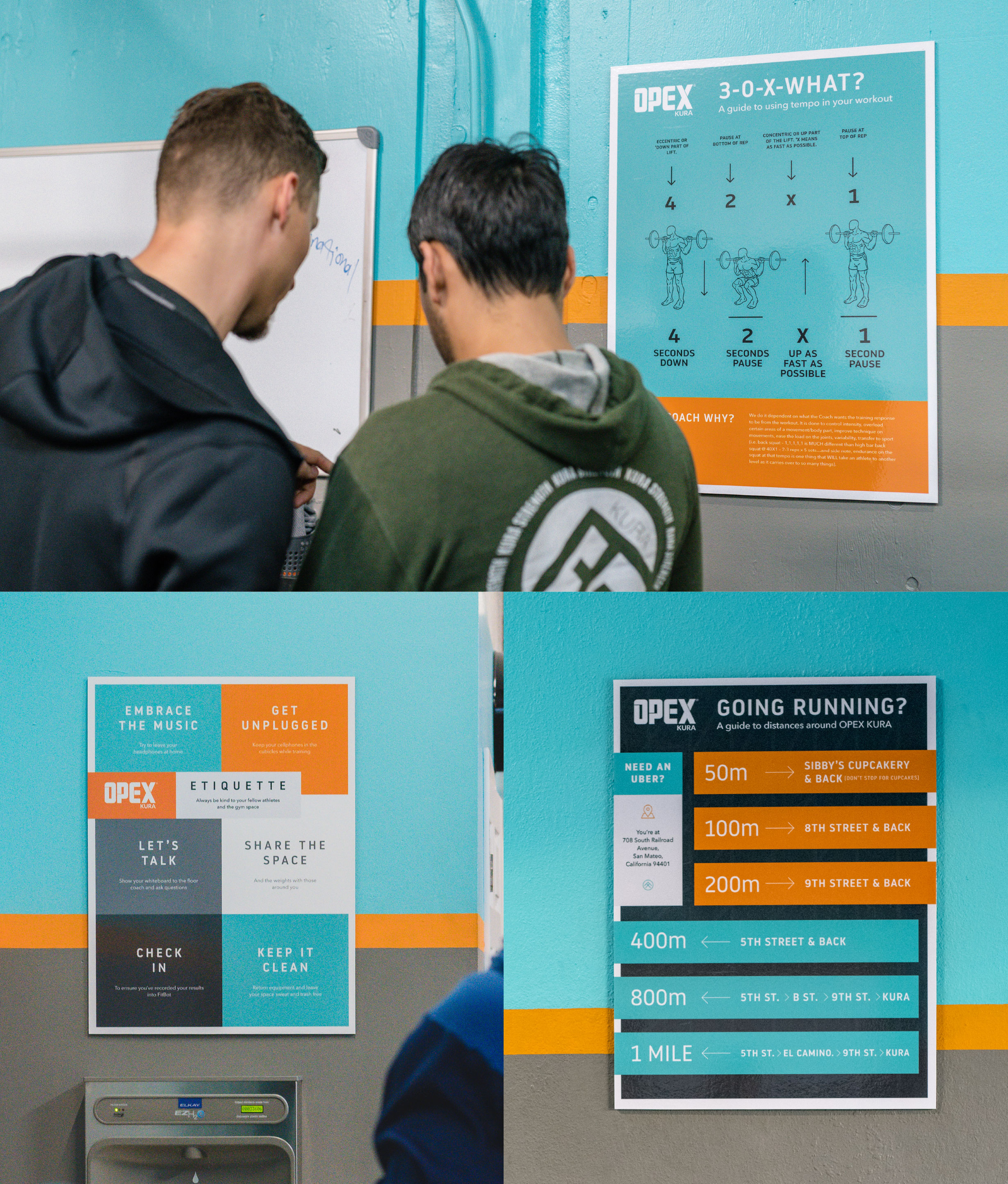
It’s important that gym members feel like part of the growth of a business. They’re not just visitors, they’re active creators of OPEX KURA. With this in mind, it made sense to debut the new brand to the members as a series of fresh, useful posters.
It’s not often that you see guidelines for politeness, kindness and all-around good vibes, but putting them up as an etiquette poster in an easy to see spot makes everyone feel like they’re on the same page.
The posters were also a tool to free up the coaches time, as the two most common questions are: “How far is 400m?” and “What’s 3-0-X-0 mean?”, so to make everyone’s life easier, a poster showing running distances and another showing Tempo were created.
“Don’t stop for cupcakes” is one of my favourite touches of this project, as it fits right in with KURA’s lighthearted vibe.
Crafting a gym experience that puts a smile on people’s face
With an awesome voice, a fantastic gym and a new set of logos, it was time to bring it all together in a brand that oozes enthusiasm and screams California.
I believe in treating brands like people. They should be a visual representation of everything you stand for, and also how it feels to be around you. When you see OPEX KURA’s stationery and speak to the owner Melissa, there’s no disconnect between how things look and how it actually feels to be at KURA. It’s good vibes only.
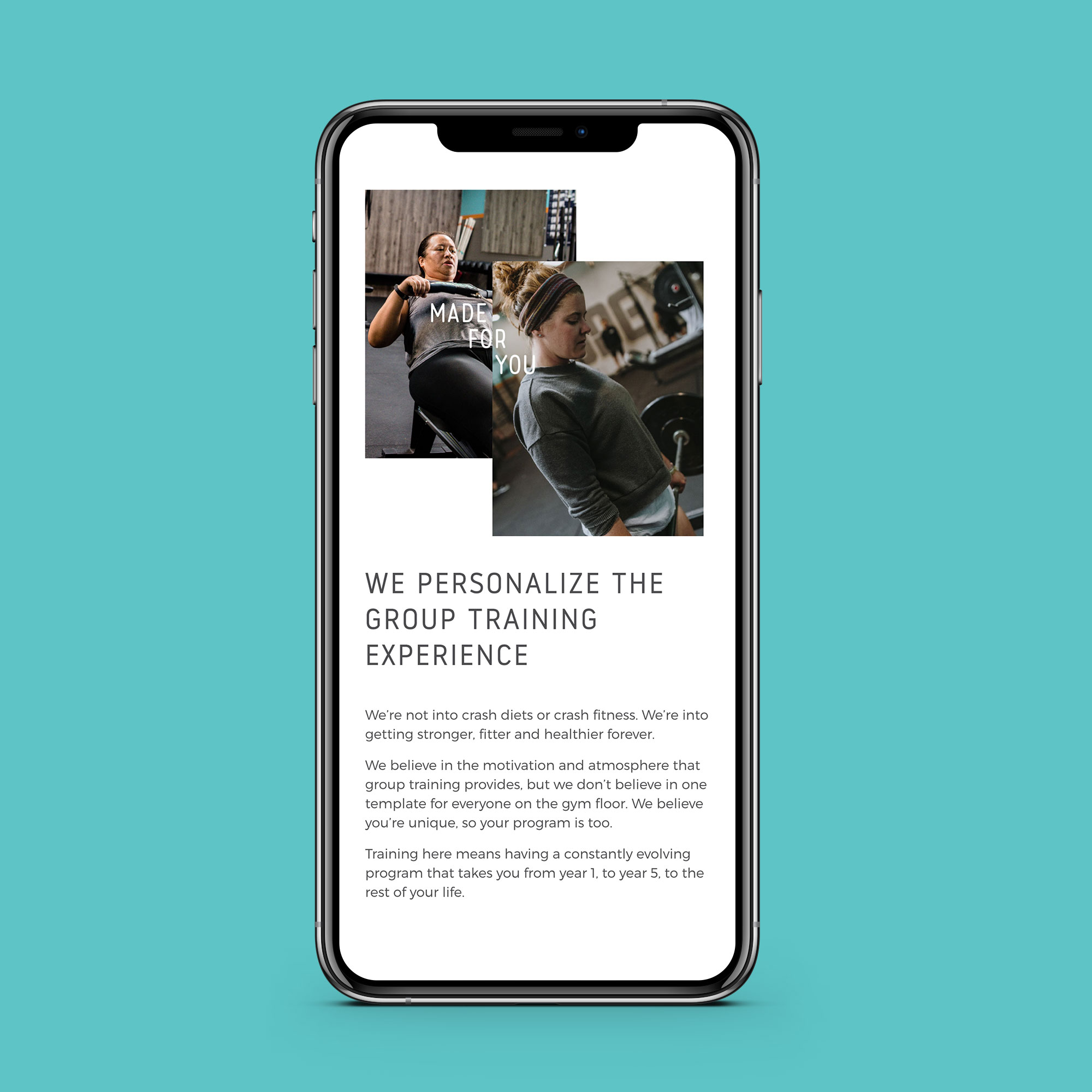
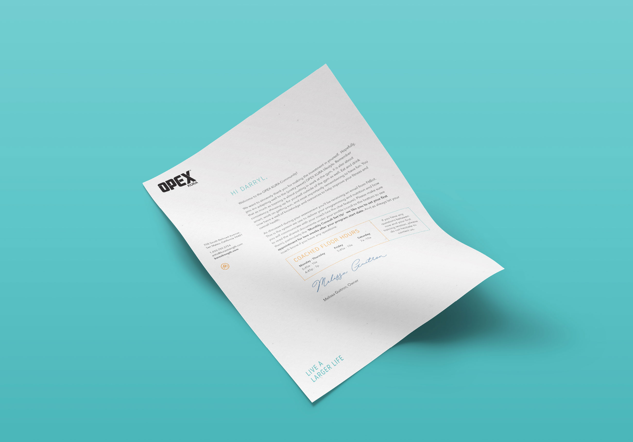
With awesome photography and a bright colour palette, the stationery creates physical touchpoints to support the engaging digital presence that KURA has. From business cards, welcome letters and greeting cards to the folders that hold it all together, the whole pack is about fostering a client experience that is unparalleled.
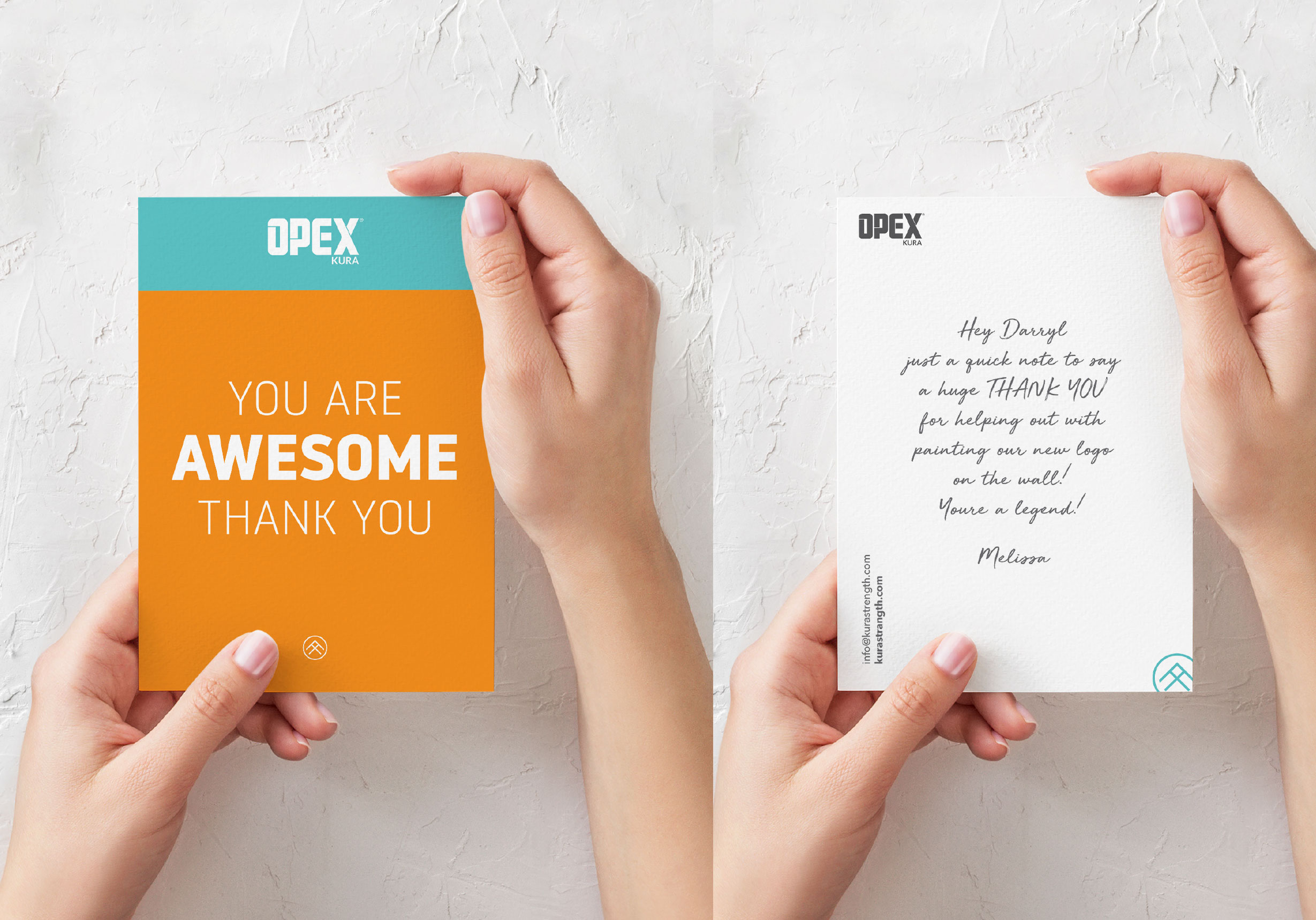
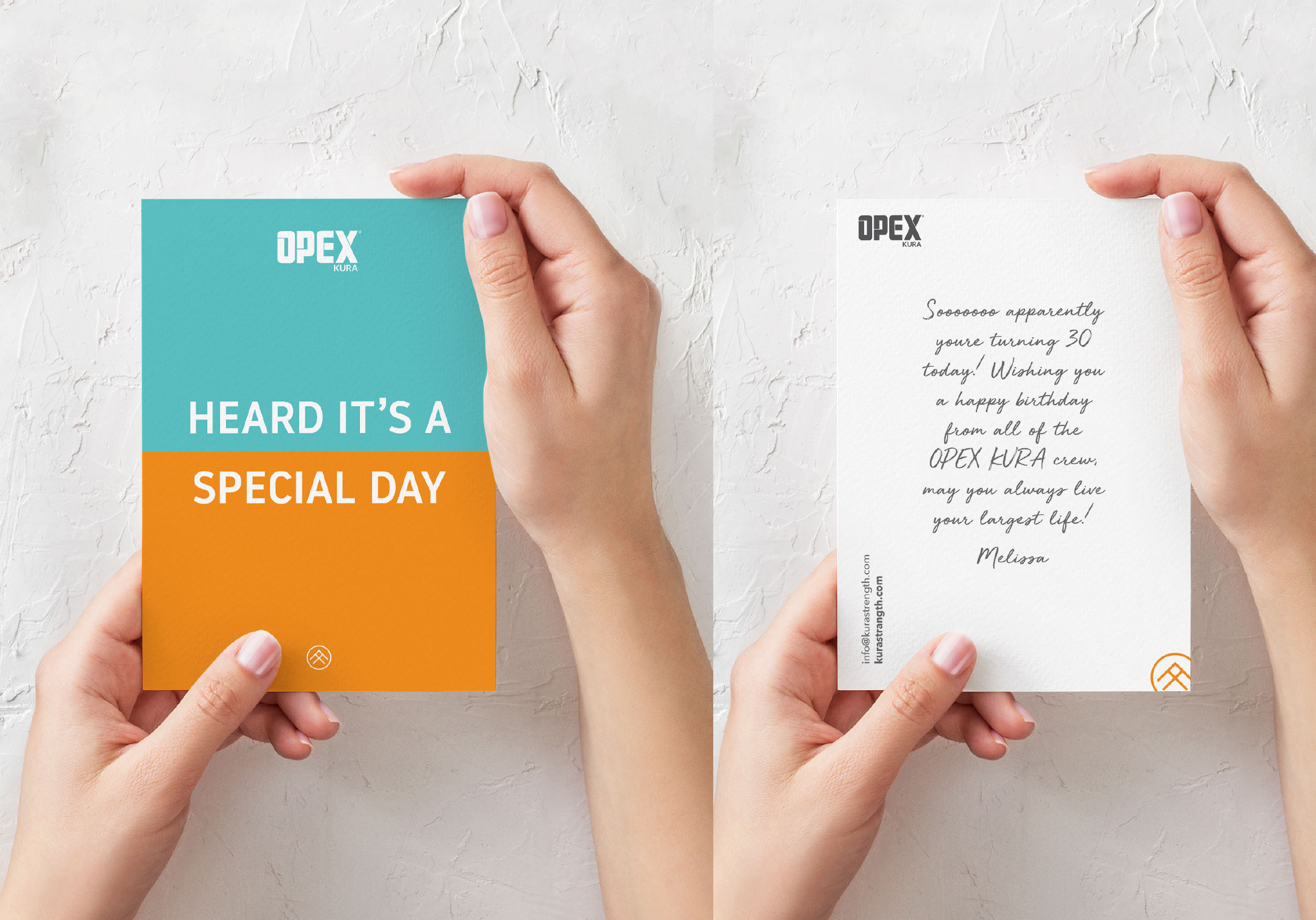
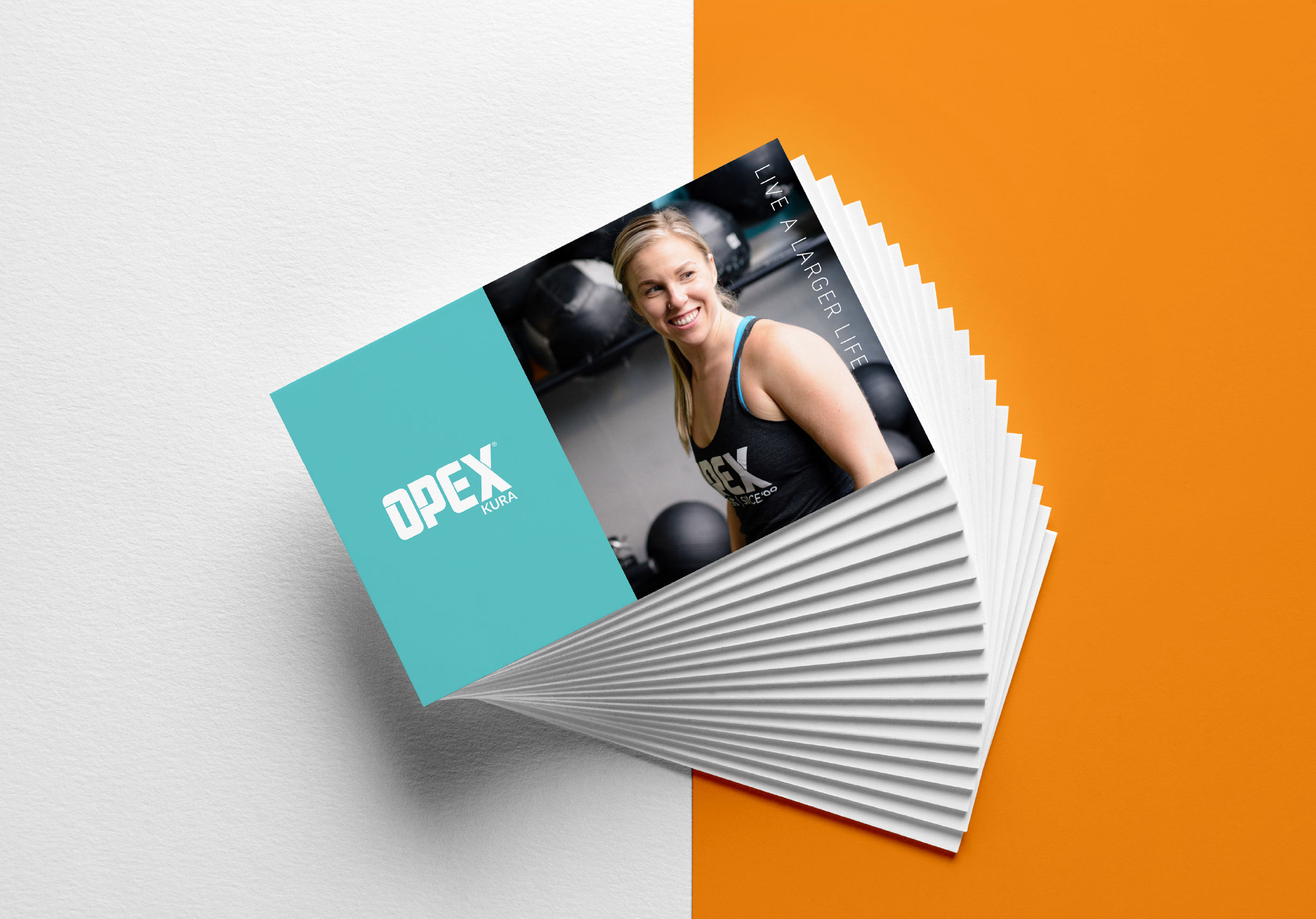
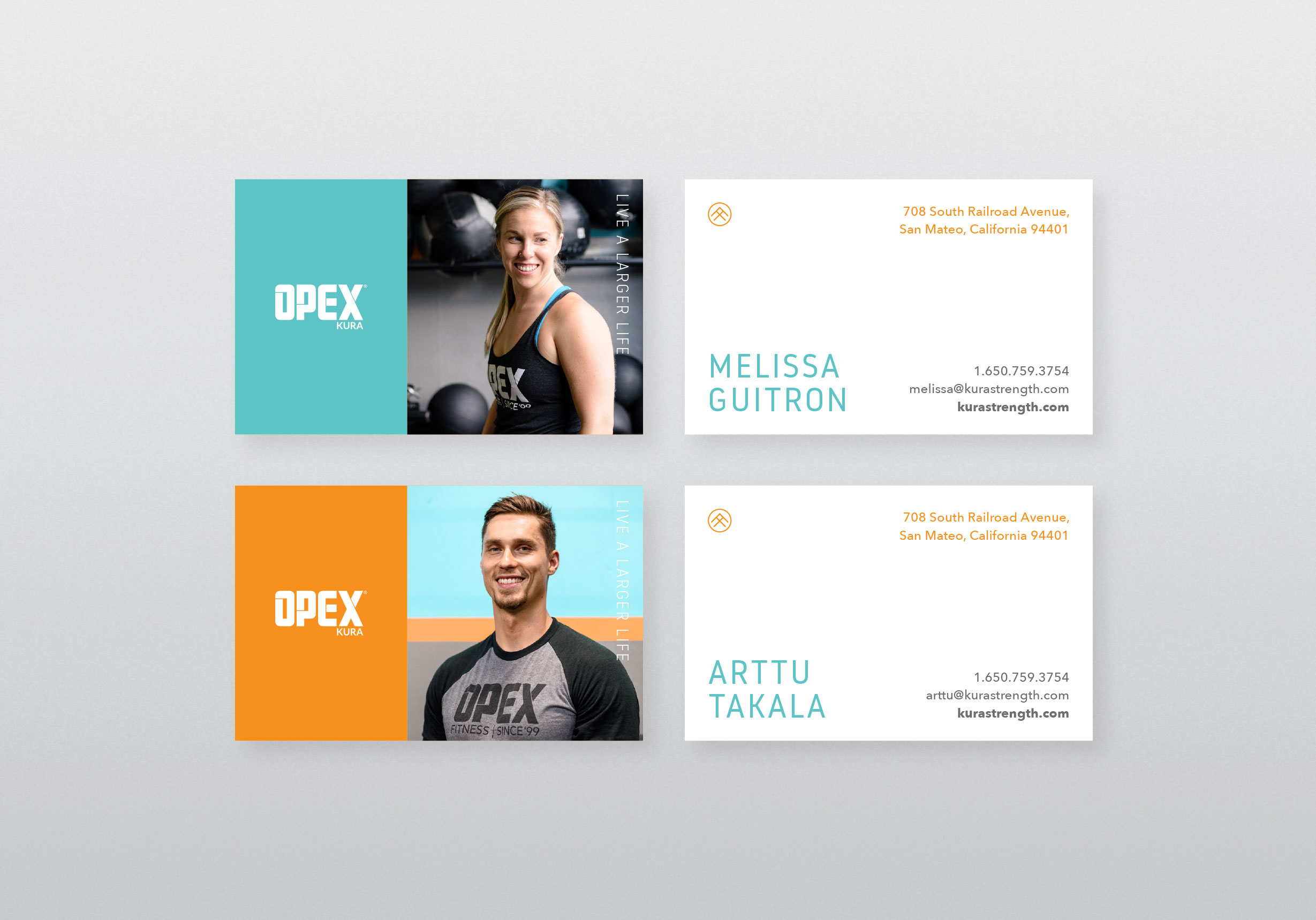
Clients but friends but clients (but friends, even on the other side of the world)
There’s no way I’d write about this project without writing about the woman who made it all happen.
When Melissa first said she’s changing from KURA Strength to OPEX KURA, and asked if I’d like to handle the rebrand, I was so PUMPED. I’d been using her content as inspiration for other gyms I worked with, I loved the vibe of KURA and found myself wondering how to improve something that’s already great.
Once we met (via video chat, because oceans) we immediately clicked. We agreed that brands are more powerful than ads in 2018. We believed in doing things like handwriting cards that were time-consuming but touched people’s hearts. We knew we could create something amazing for OPEX KURA.
Melissa’s a dream client. Her enthusiasm for her work and her community is infectious. When I suggest things for us to work on, no ambition is too crazy, no concept too ‘out there’, and she doesn’t want anything that follows the status quo. And that’s how she approaches life. A true original and someone I’m proud to call not only a client, but a great friend.
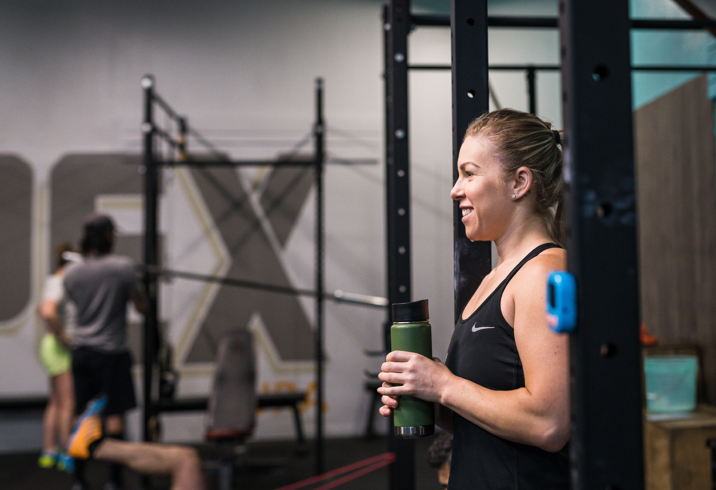
Boris is a visionary. He is the resourceful, kind and super talented force behind the OPEX KURA brand. He takes our outlandish and big ideas and makes them real. He is the warm smile at the other end of the world who we trust with everything design, and we’re not the only ones.
In our circle, he’s almost everyone’s go-to for brand development for one simple reason: his work is just so good. From brand concept to merchandise design to an awesome website, working with Boris and Metcon Creative to brand your business is a no-brainer.
Melissa Guitron, Owner, OPEX KURA
More good work for good people
