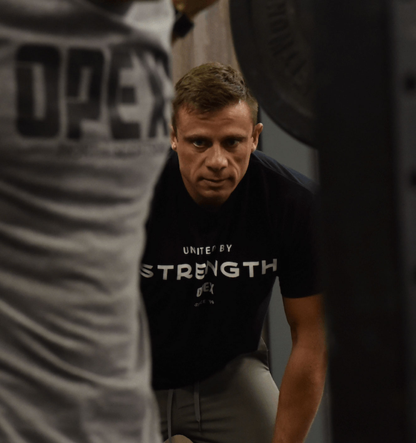
The evolution of a brand delivering inspired lives through fitness
Client
OPEX Gyms
The evolution of Personal Training
Goals
Goal 1. Build a consistent brand
that aligns with OPEX’s mission to professionalize the fitness industry.
Goal 2. Create a professional brand
that would ensure all OPEX licensed
gyms look premium.
We created
Clear Brand Workshop
Tone of Voice Identity
Brand Identity
Stationery Design
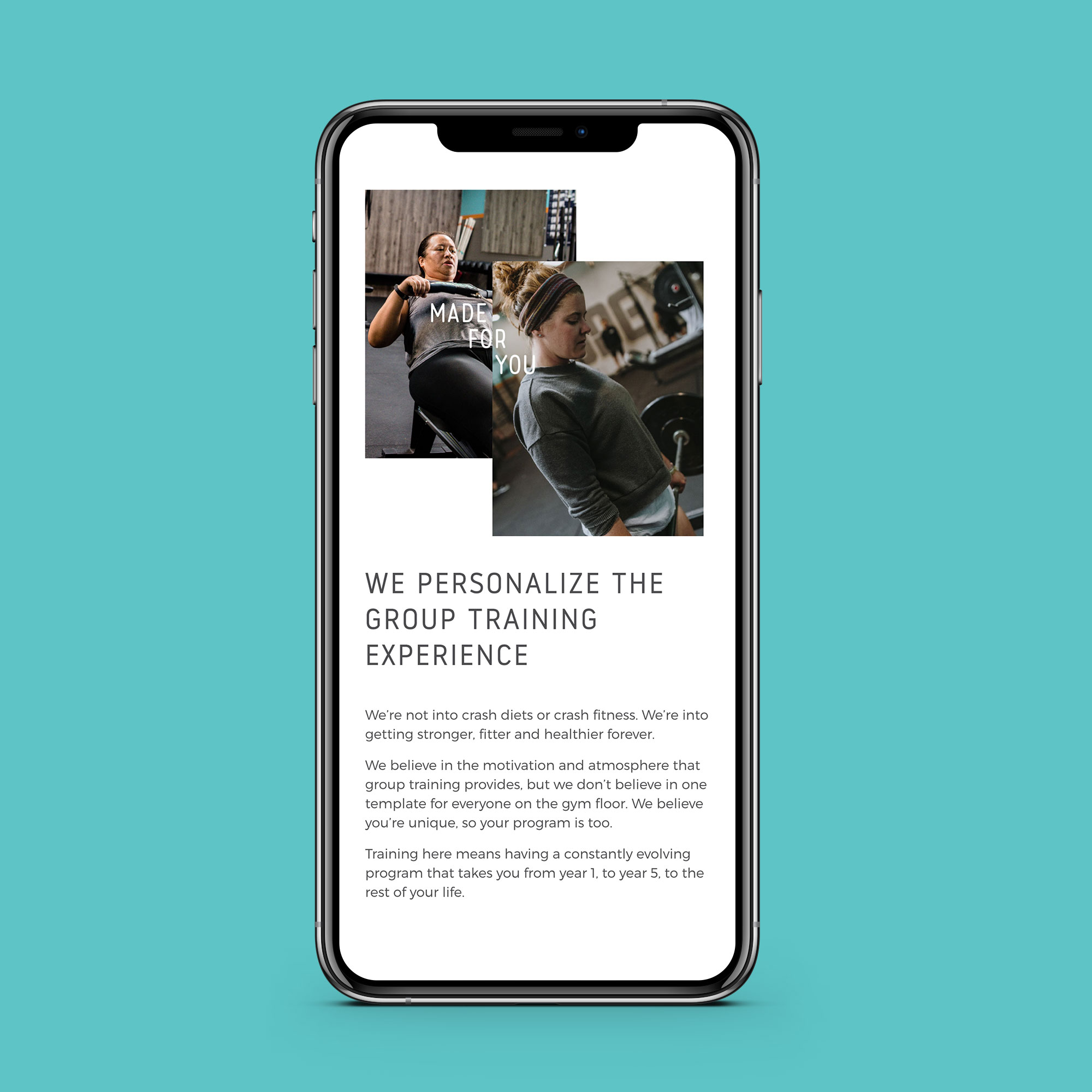
Website Design
Social Media Design
Website
Merchandise Design
Brand Manual
The evolution of OPEX Gyms
I was really fortunate to work with a number of OPEX Gyms on their own branding before working on the evolution of the overall brand with OPEX Gyms HQ.
In one of the highlights of my career, I was invited to speak to gym owners from around America (and one from the UK) about the power of branding for their gym. Once I was home, it was time to work with HQ on the overall OPEX Gyms brand.
The goal of this project was two-fold:
1. Create an appealing brand for OPEX Gyms HQ with a premium feel.
2. Design a baseline brand for the gyms who want to look premium, but don’t have the capacity to hire a professional to design their brand.
The approach
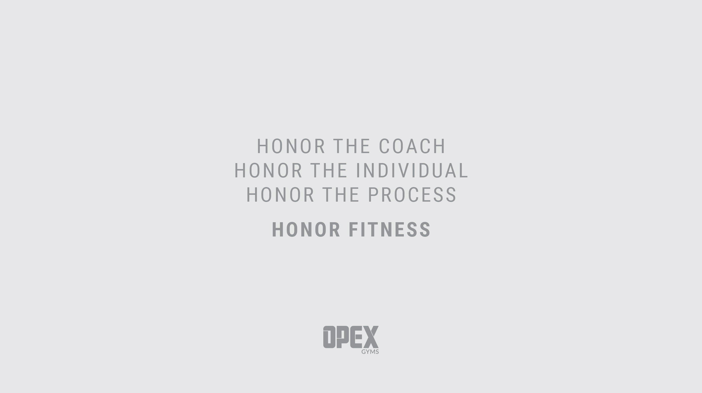
The first step was to find out exactly what makes someone an OPEX person. In our Clear Brand Workshop, we found that the underlying reason that OPEX exists is a deep respect for fitness. Its ability to influence culture, its ability to change lives, and the current need to professionalize the coaching industry.
Every decision moving forward was based on clarity and consistency, with HQ setting the tone for the gyms. Everything from the colour scheme to the font choice was designed to be adaptable, finding its home in North Scottsdale, Arizona, and Lancaster, Pennsylvania alike.
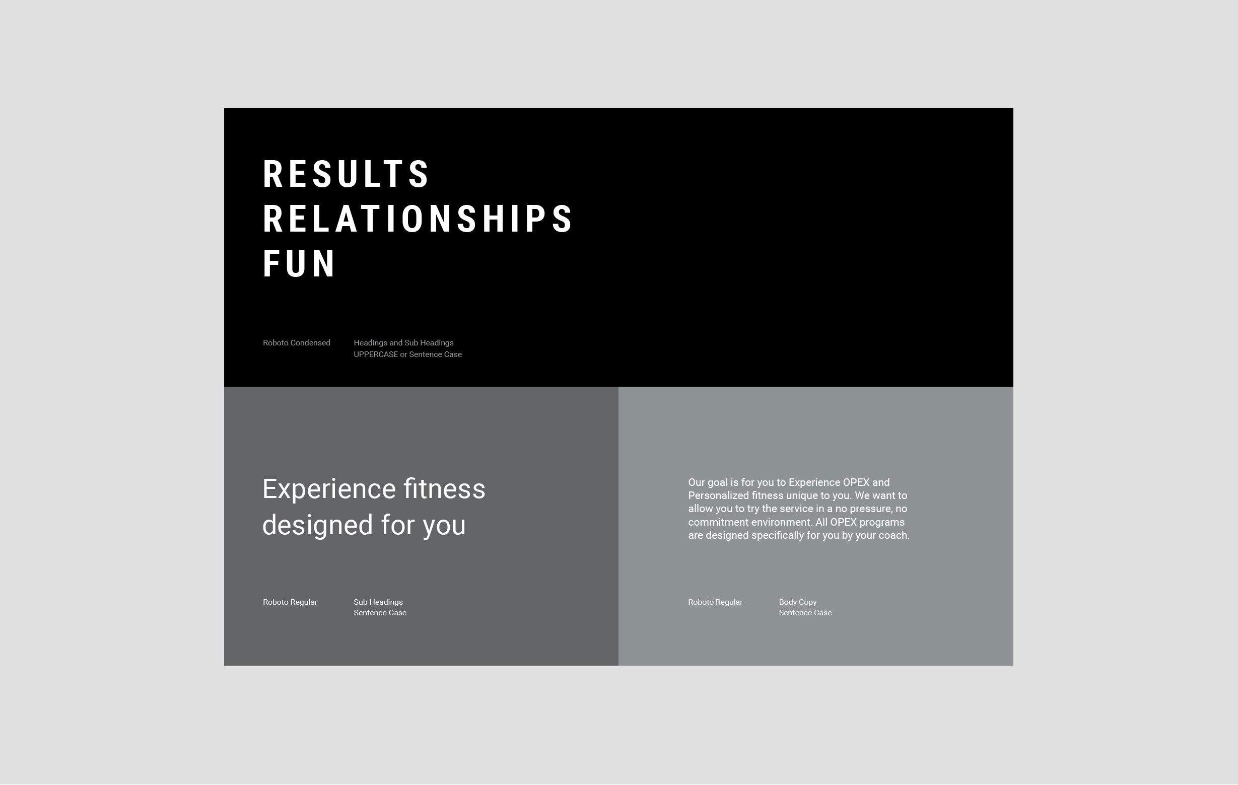
Starting with the basics - fonts and colours
When dealing with established brands, it can be tempting to change everything for the sake of it. With OPEX, the name of the game was refinement, not a knock it down and rebuild it approach. The font that OPEX had been using consistently for years, Roboto, would remain, but through a more refined approach to spacing and layout, it would bring a new degree of sophistication to the brand.
When it comes to colours, HQ sets the foundation, and the gyms add vibrancy. Black and white were chosen as the primary colours for HQ, leaving a wide range of colours available for the licensed gyms.
Bringing sophistication and consistency
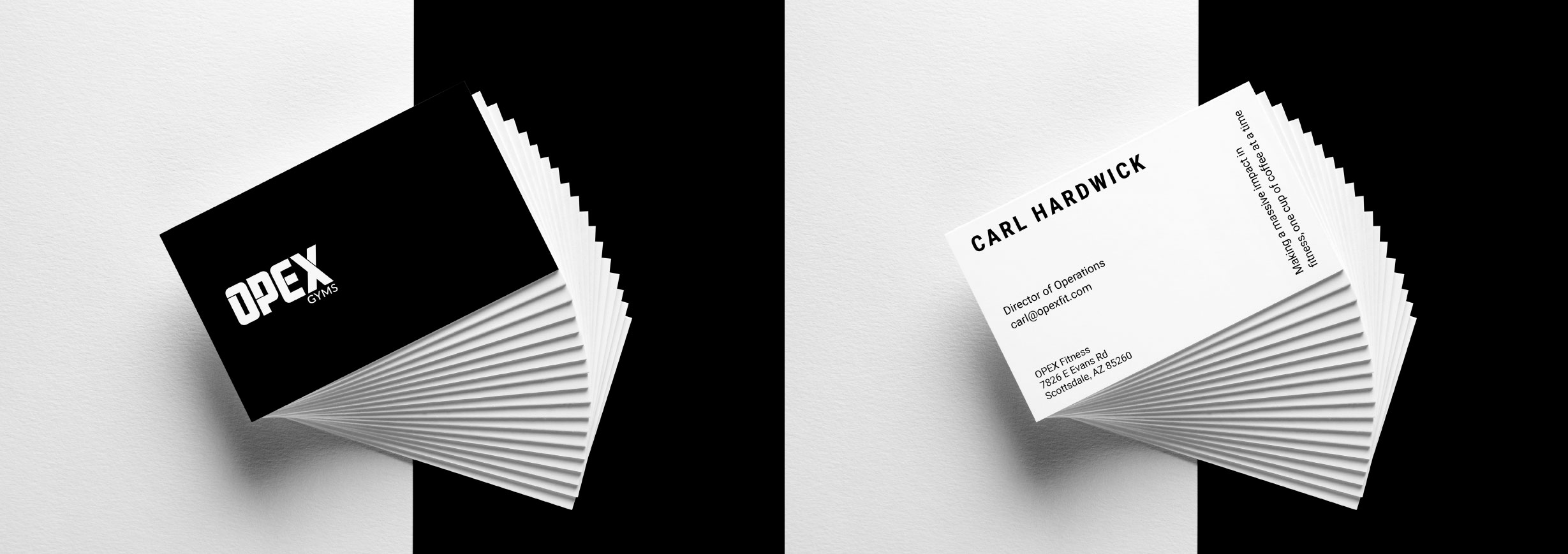
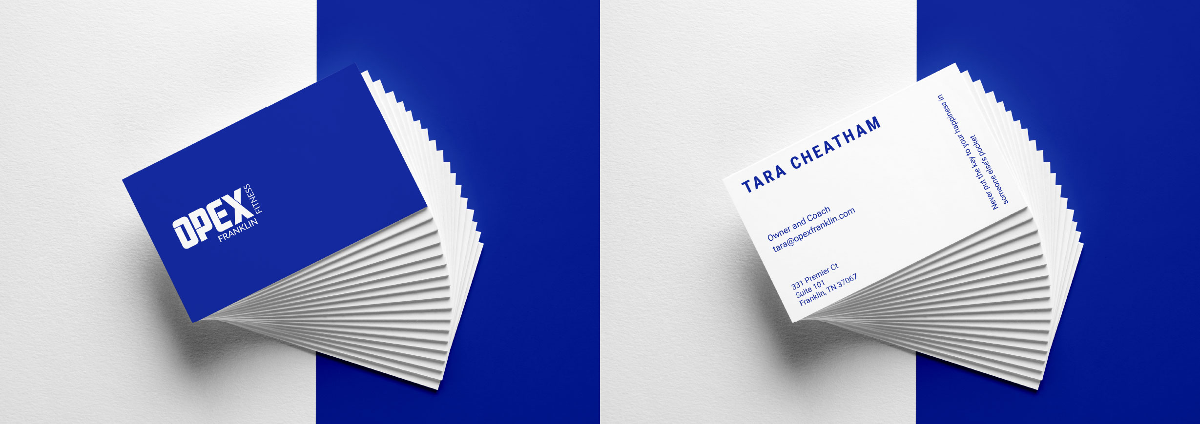
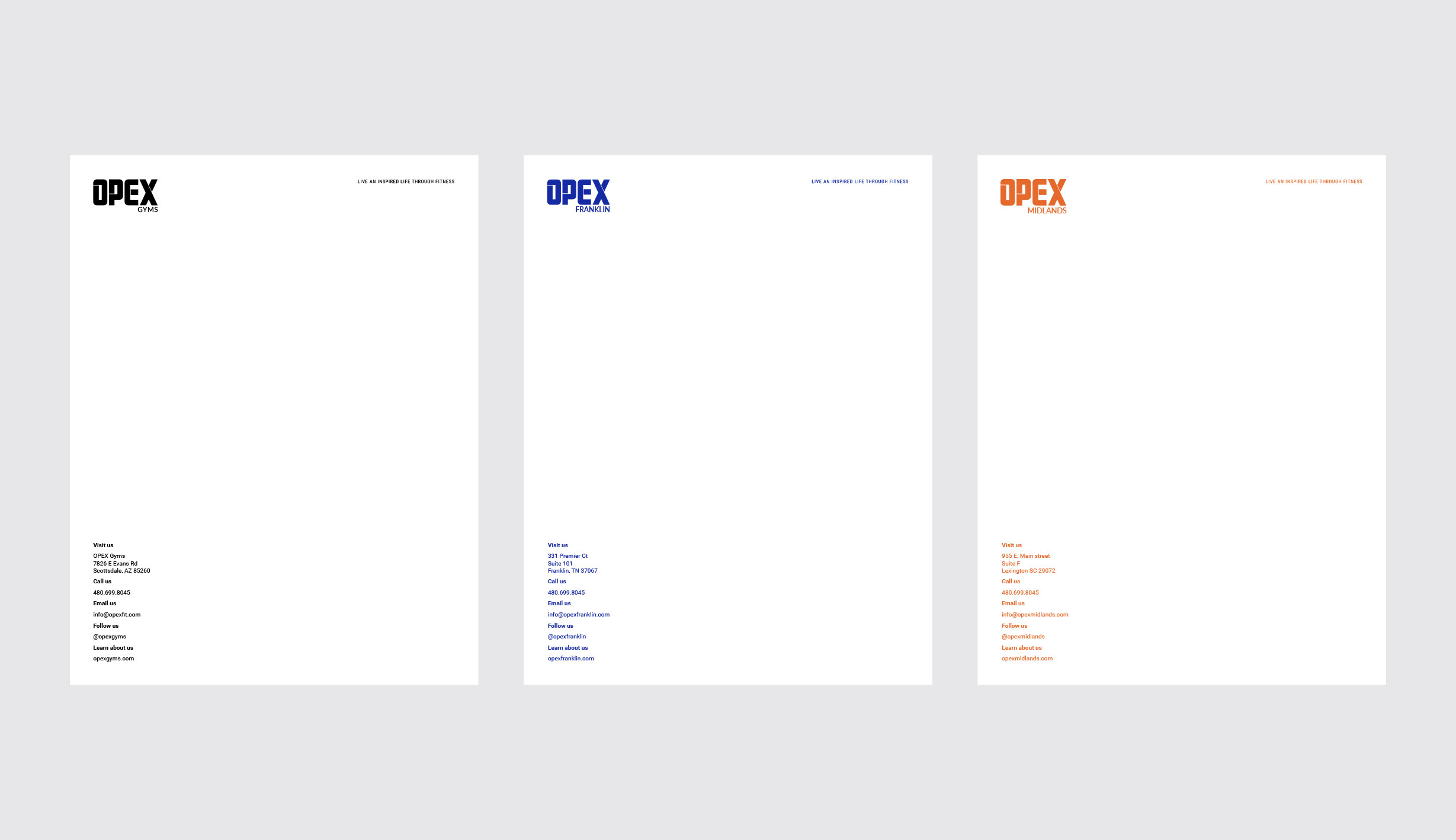
Onboarding gyms and getting their brand up to speed quickly was a major consideration during the design of this brand. Creating a premium design for business cards, letterheads, and sales documents meant creating a well-functioning system that gets gyms looking professional from the start.
The gyms would choose colours suitable to them and their target audience, and HQ would use these templates to ensure that all gyms uphold the integrity of the OPEX brand.
Everything that was created for the OPEX Gyms HQ brand could be adopted to the gym’s branding by using their own colours and logos.

The Culture Kit
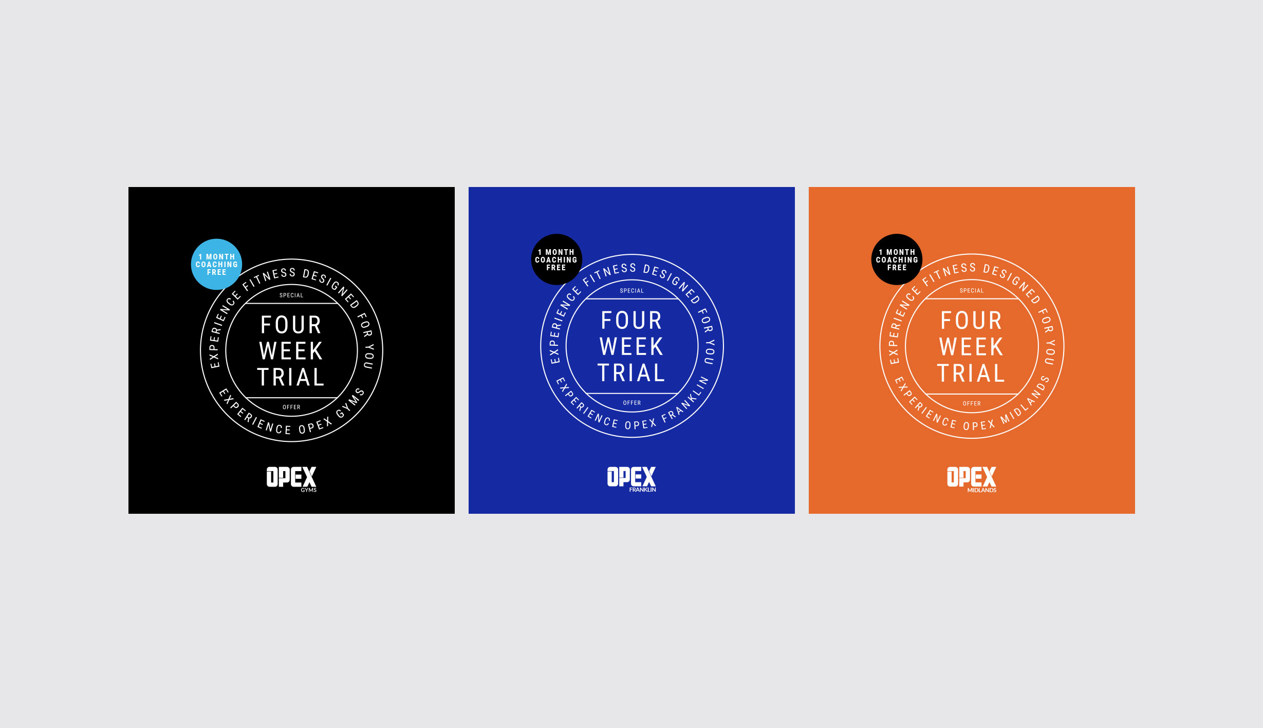
While the brand needed to look premium and professional, breaking some of these barriers is often necessary to connect to your audience. A culture kit of icons and badges is an ideal way to communicate the brand’s personality and values in an engaging way.
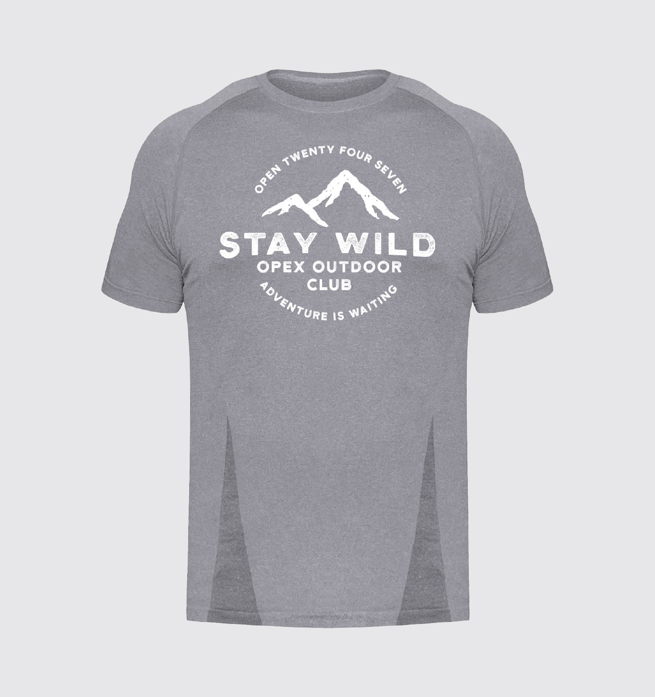
My favourite is the OPEX Outdoor Club badge, which sparked many a hike and outing at the beach for OPEX Gyms around the world and aligned perfectly with OPEX’s focus on Basic Lifestyle Guidelines like getting adequate sun and time in nature for health.
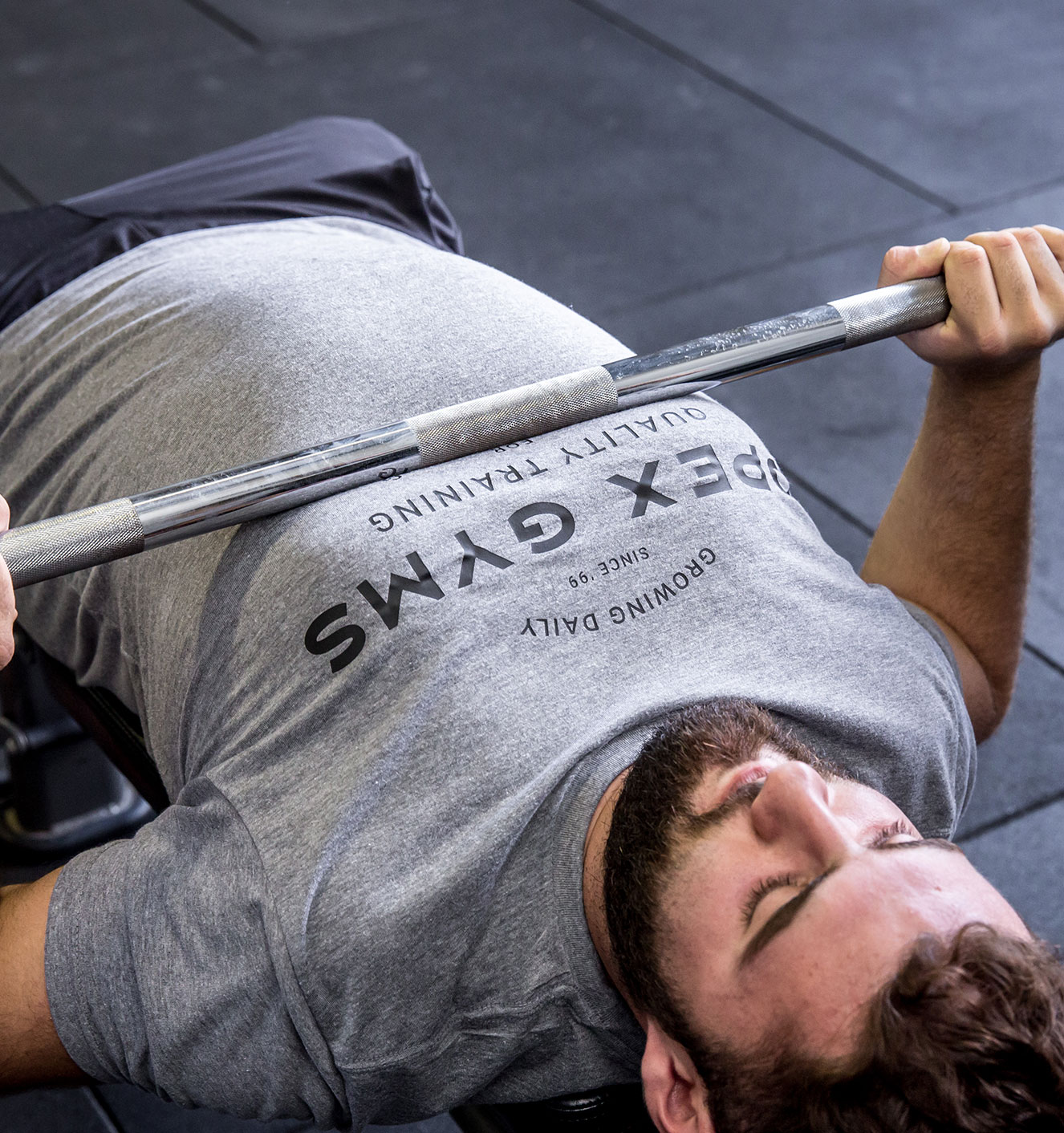
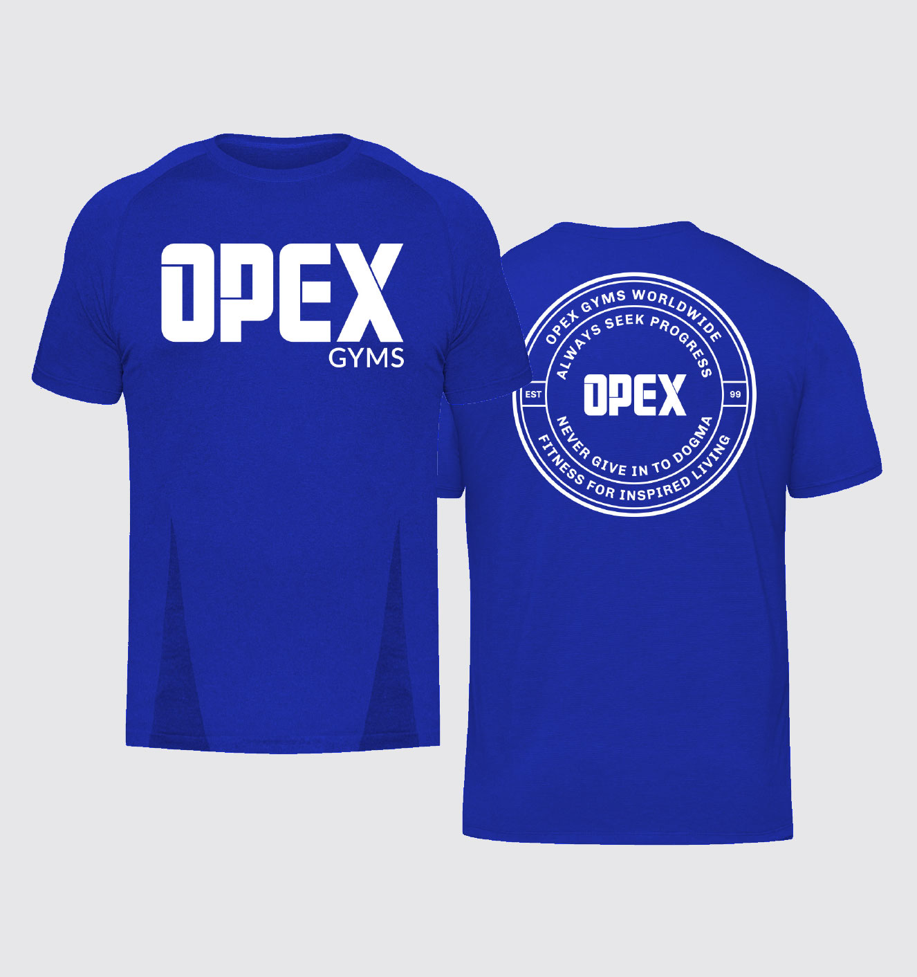
A brand comes alive when its fans can wear their passion on their literal sleeves. Using the culture kit, clothing was designed that was equally at home in the gym as it was at a casual dinner outing.
More good work for good people
