A website that
feels like home
Client
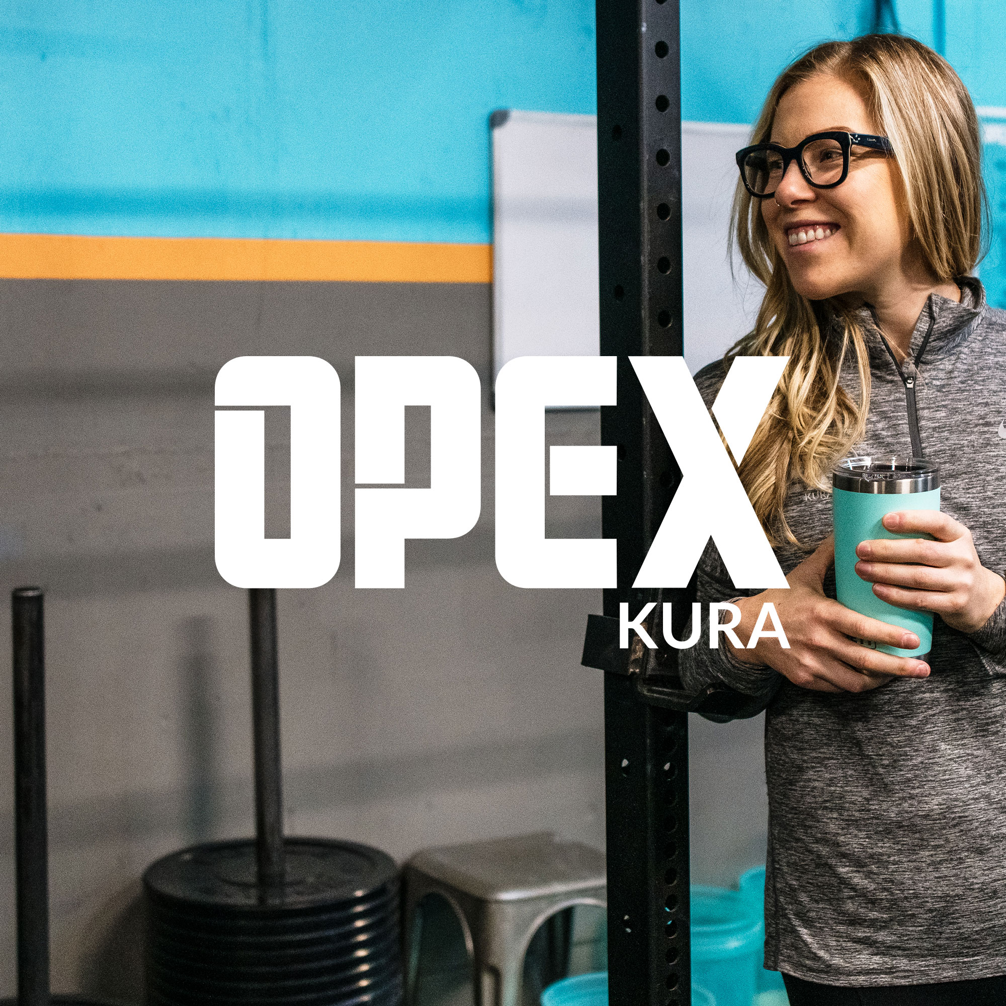
OPEX KURA
Tangible results are non-negotiable at this boutique
gym in San Mateo, California
Goals
To bring the website into alignment with its new brand, creating a home for the vibrant OPEX KURA community
We created
Website Experience Plan
Website design
Wordpress Build
Wordpress Training
Video Tutorials
We created
Website Experience Plan
Website design
Wordpress Build
Wordpress Training
Video Tutorials
A website to belong to
Forget what a gym website looks like. What does a healthy community website look like?
Having brought the brand to life, OPEX KURA owner Melissa was thrilled with how the new look & feel of the gym was been received by her people.
With a lot of respect for her brand-savvy audience, many of whom work in Silicon Valley, we needed to create a site that was based on authenticity, not hype or sales strategy.
Melissa and I started planning for a website that would bring the good vibes and put OPEX KURA on the map as the connector of all things health and fitness in San Mateo.
Breathing new life into the gym
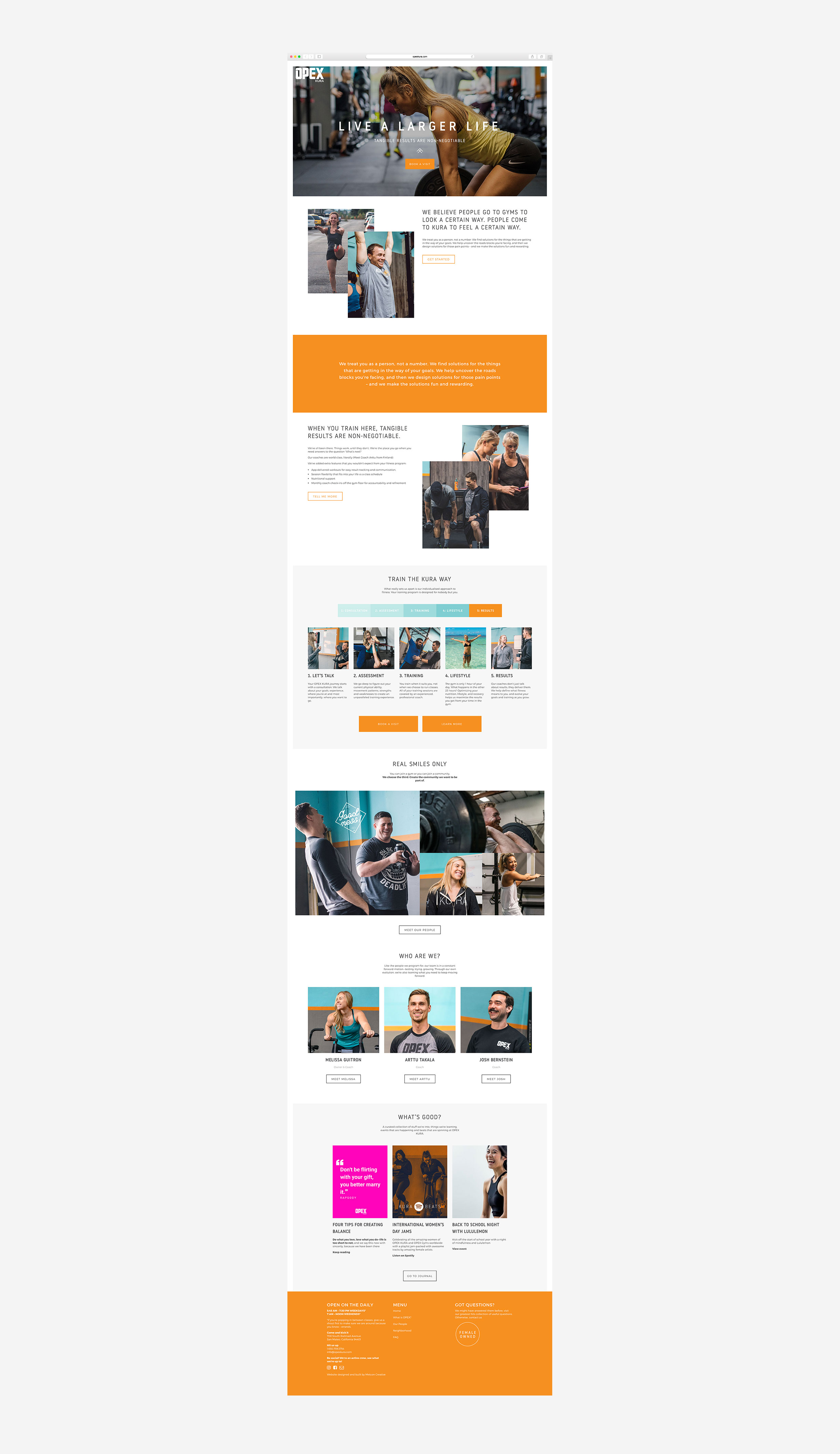
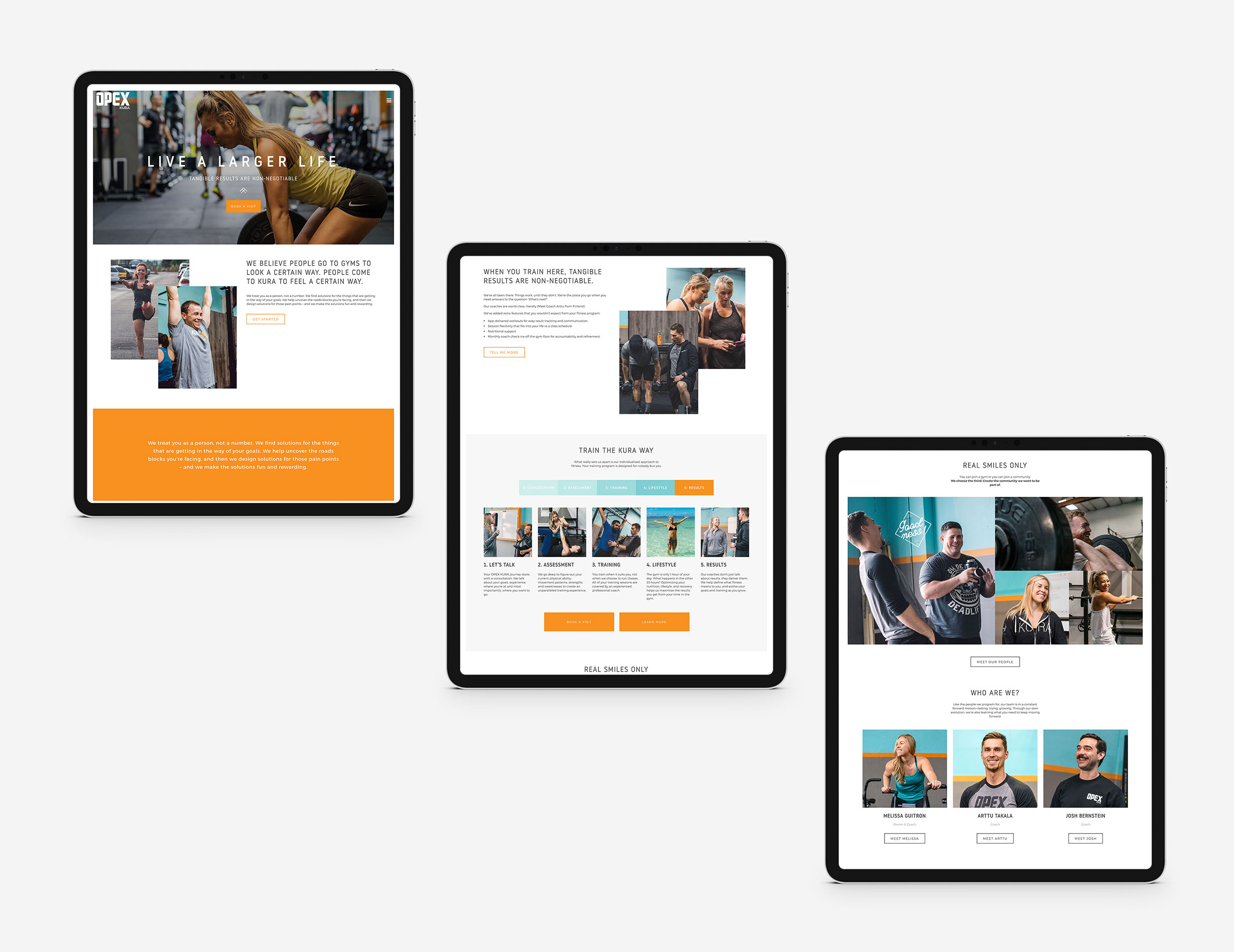
Make it clean. Make it vibrant. Keep it real. Those were the guiding principles for the design of the site. The design uses a lot of white space, and lets the vibrant images of KURA’s people add the colour.
The language throughout the site is written in a conversational tone, pre-empting the culture you can experience from the OPEX KURA team and community.
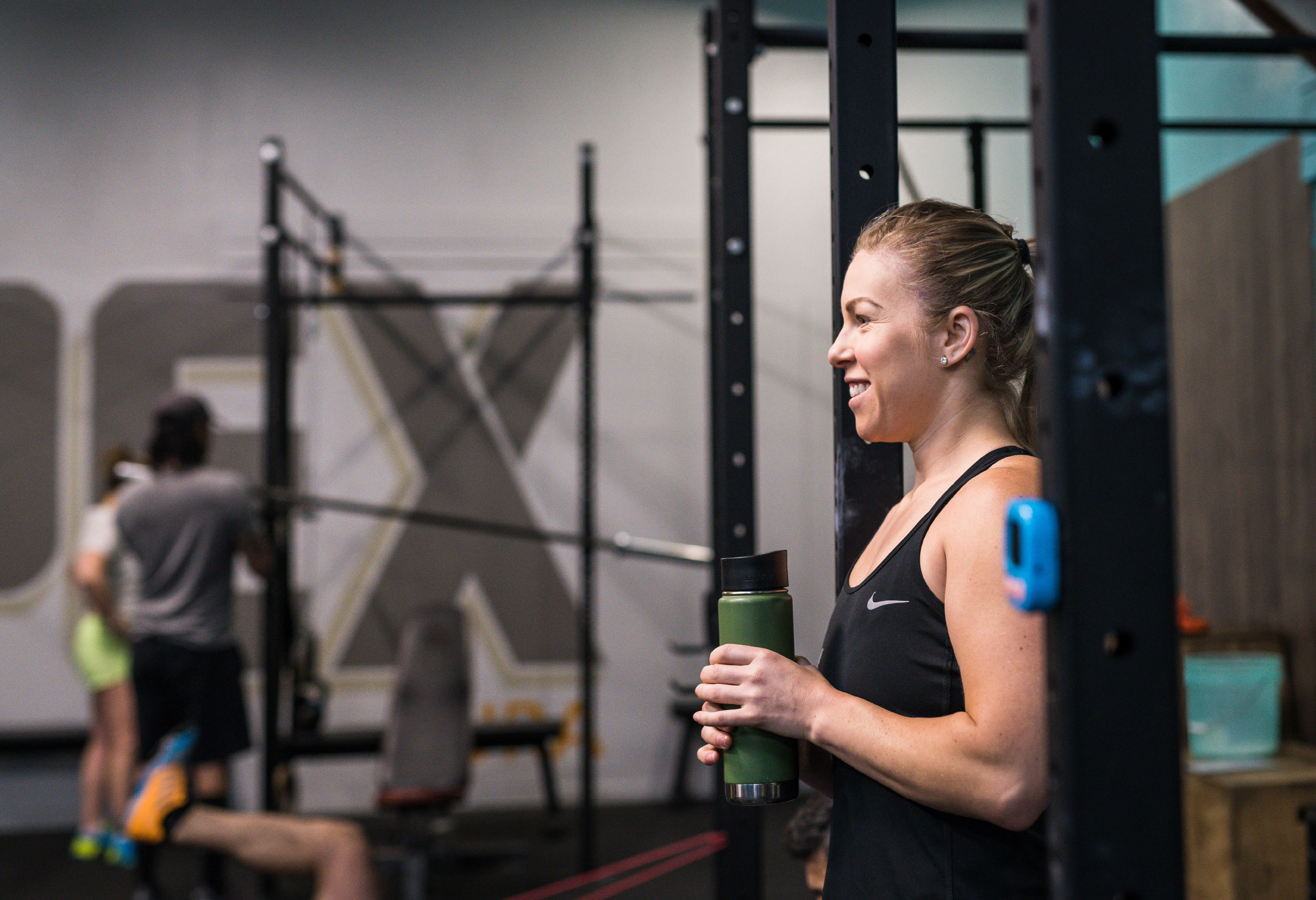
Melissa says that people go to gyms to look a certain way, but they come to KURA to feel a certain way. I designed the website so that anyone who scrolls through the website would feel the warmth and brightness of the gym, using images of people who not only look fit, but also show the endorphins that come with it.
Explaining Personalized Fitness
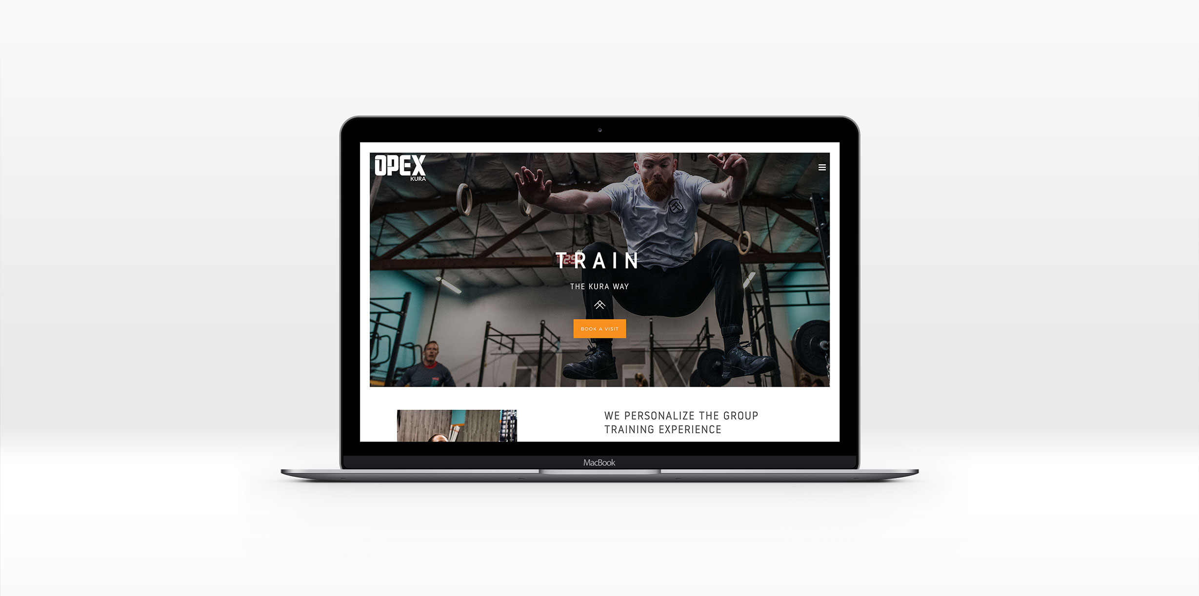
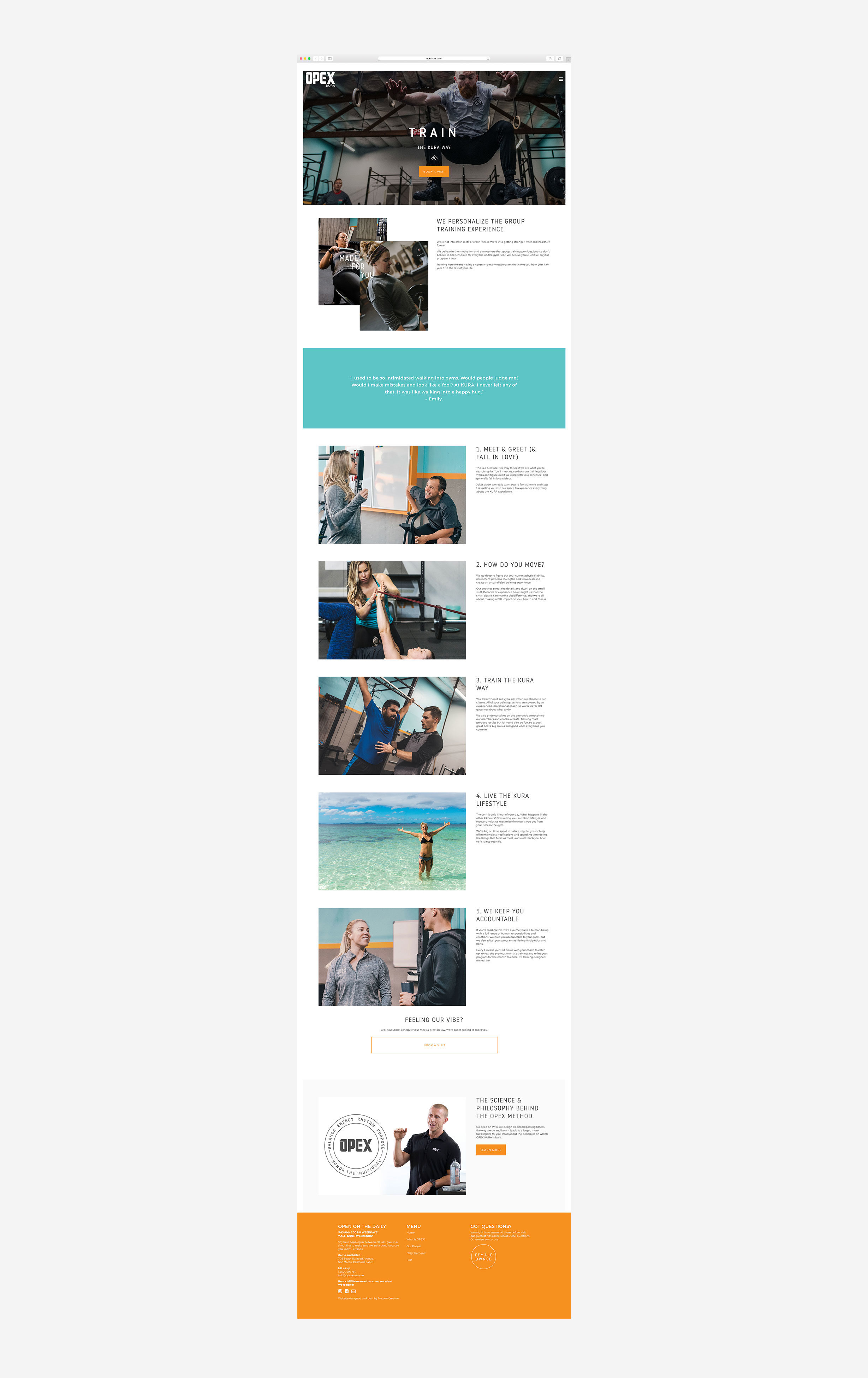
While the OPEX Gyms approach makes a ton of sense for any of us who’ve ever felt like we’re missing out on progress in a group class, it’s still a new concept for most people lshopping for a gym.
OPEX KURA’s Train page takes the audience on a journey through what they get at KURA, combining visuals with simple explanations.
Highlighting the people that make KURA, KURA
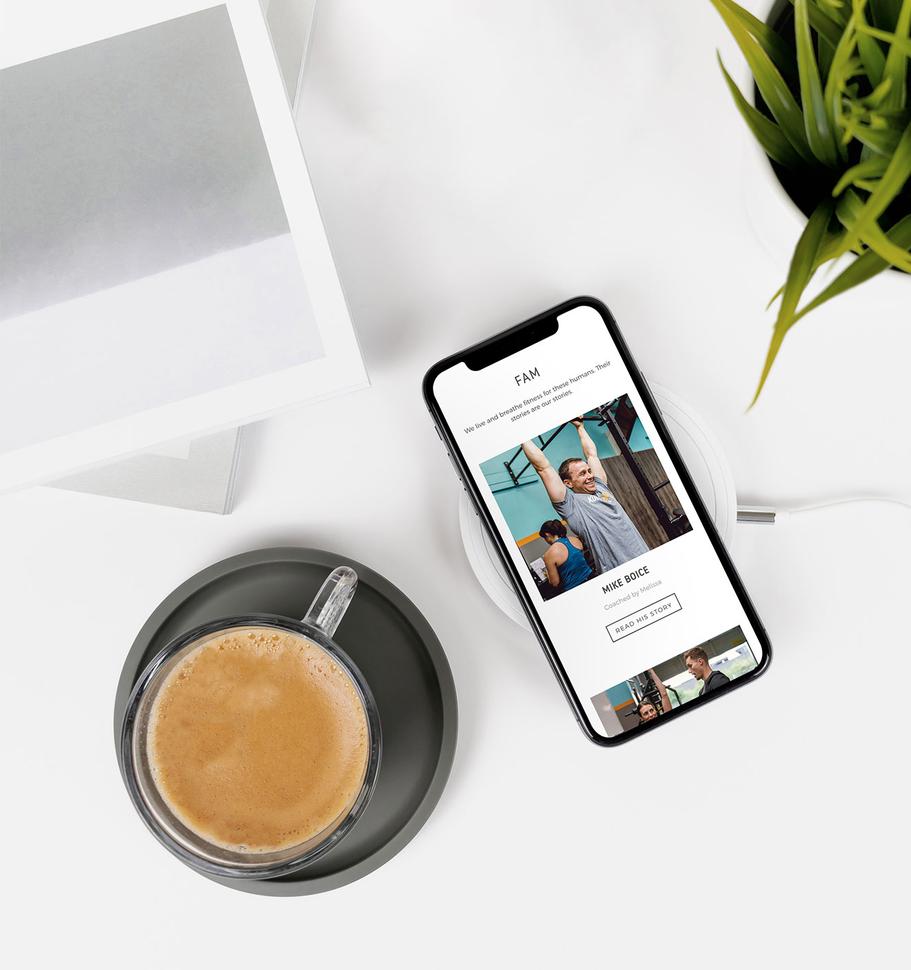
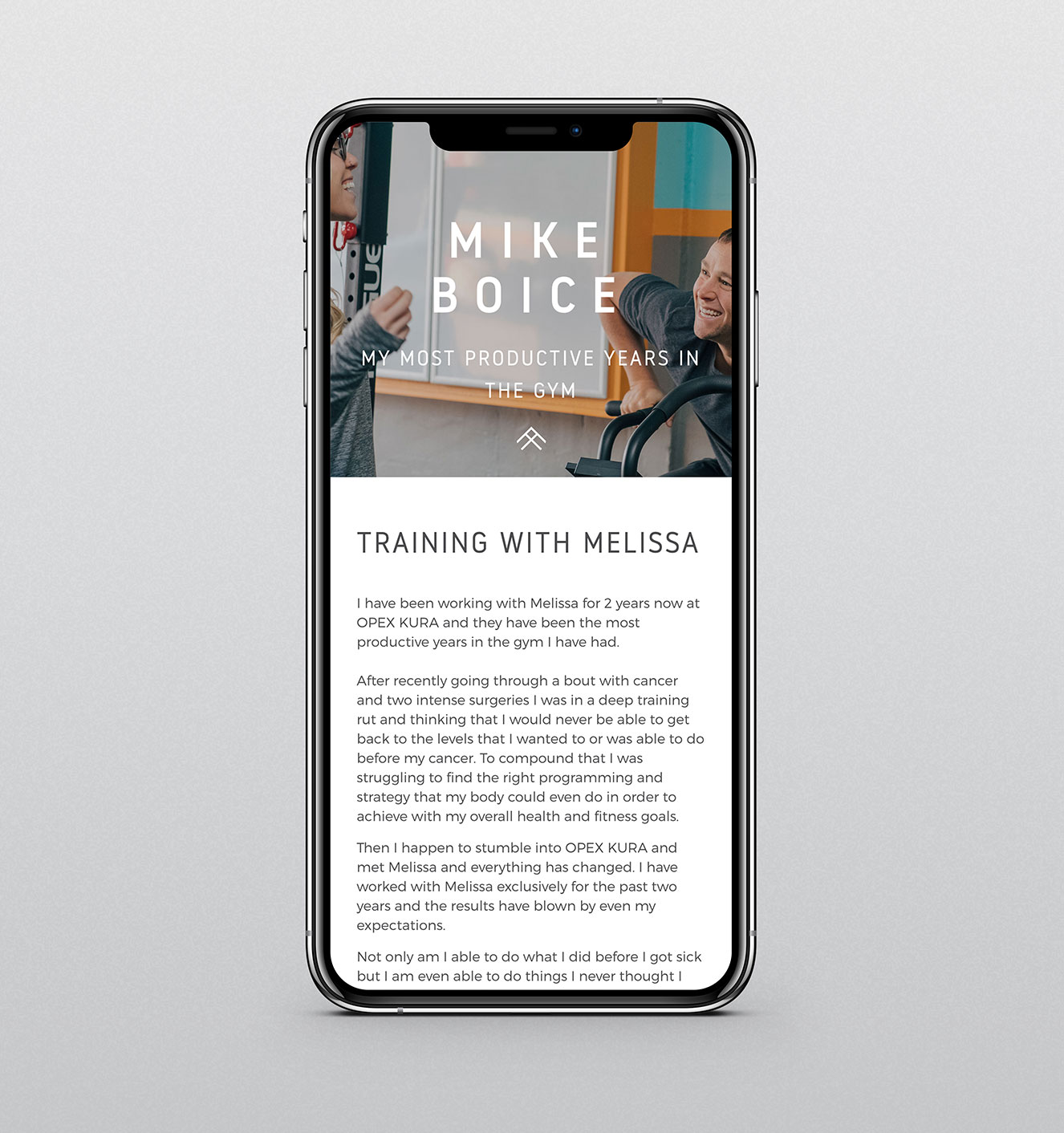
The clients give OPEX KURA a heartbeat, and telling their stories is key to the website’s success. Rather than just listing testimonials, each client is given a feature that goes beyond before & afters. Each client story details how OPEX KURA has impacted their life in and out of the gym, and finished with an invitation to join the community.
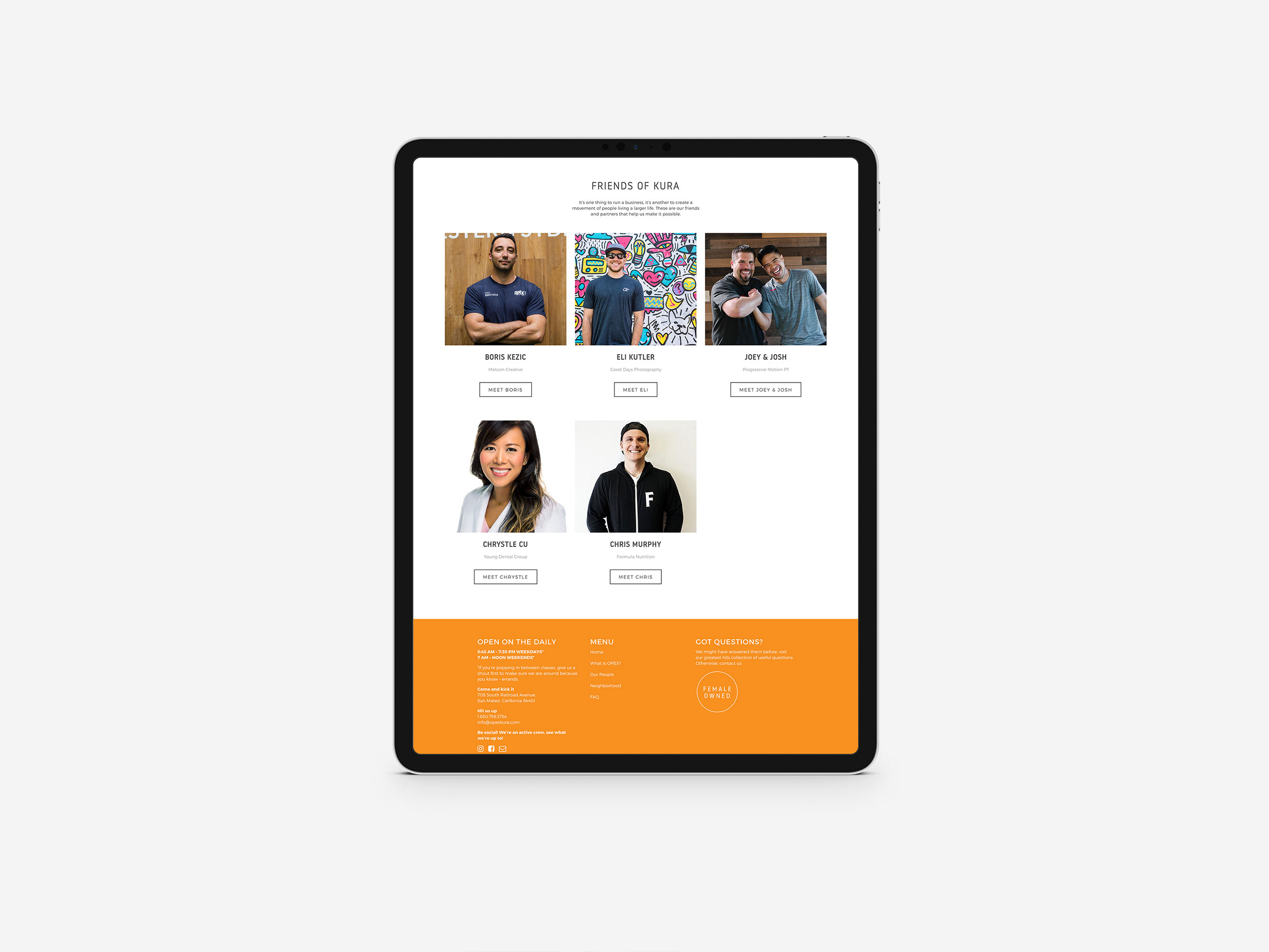
Friends of KURA
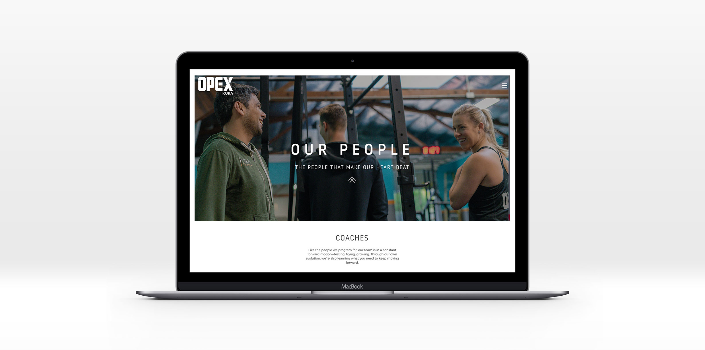
It’s one thing to run a business, it’s another to create a movement of people living a larger life. Melissa wanted to highlight the collaborators that make OPEX KURA’s success possible, and the Our People page was born.
From coaches to physiotherapists, nutritionists, creatives and even the KURA-approved dentist, every person who brings KURA to life is given credit for the part they play, building a culture of gratitude and reciprocity.
The local guide
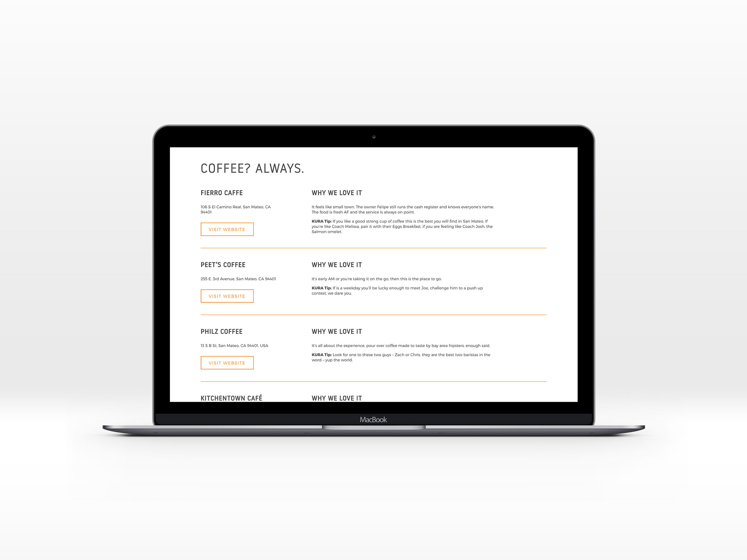
When creating a brand experience, it’s important to think about the end client, in this case OPEX KURA’s members, so you can craft a service that’s valuable to them.
Since a lot of people move to San Mateo because they’ve scored a tech-industry job, it can be hard to figure out the good places to eat, train and spend time outdoors.
To serve them better, I came up with the idea of having a local guide for all things healthy living on the website, and Melissa was 100% on board.
This guide of San Mateo’s best coffee shops, restaurants, grocery stores and hiking trails has become a go-to for KURA’s audience, and builds a ton of good faith with other local businesses, increasing the chances for referrals and collaborations.
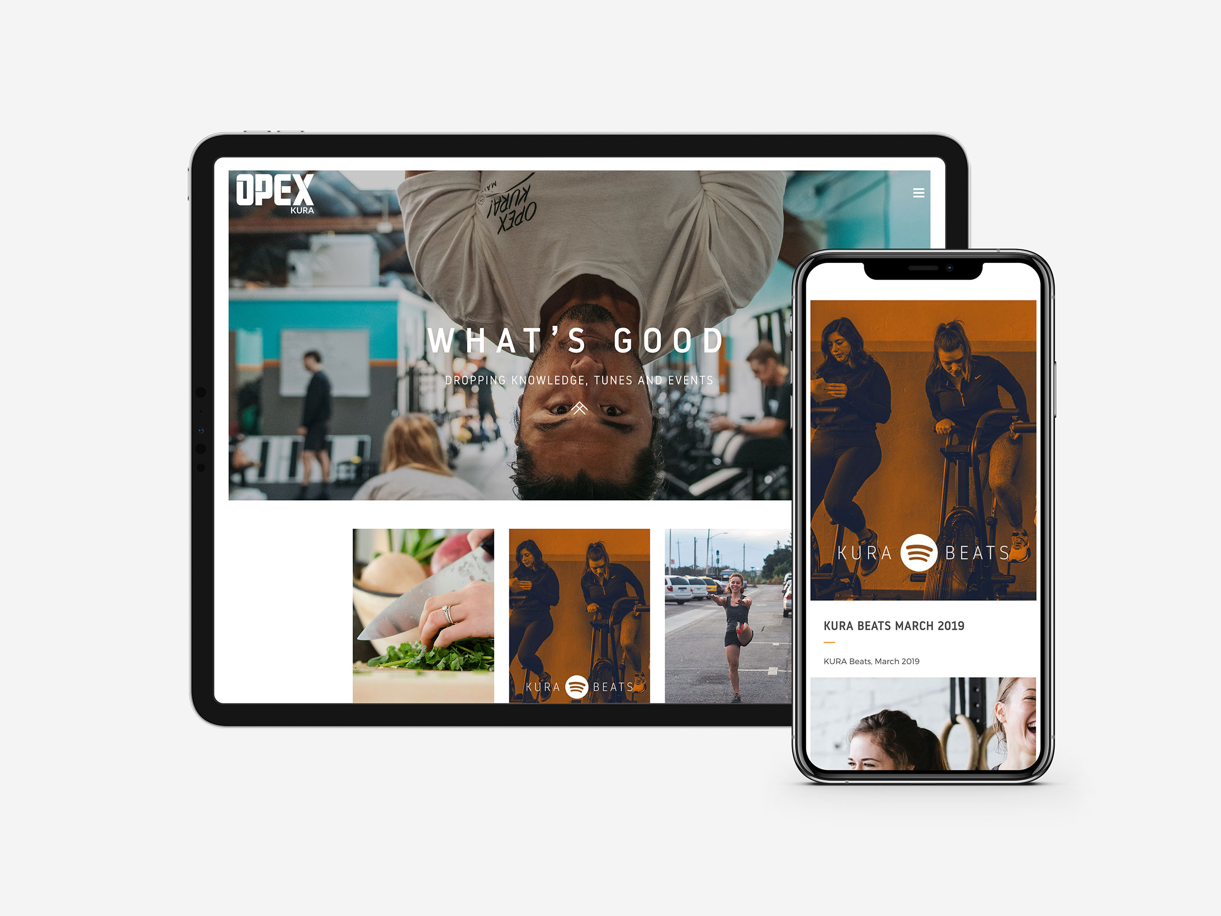
What's good? - The Journal
One of Melissa’s main issues with her old site was that posting blogs was an arduous process, and she wanted to be able to share content with her people.
We brainstormed some content ideas that could be updated every month, including events and a monthly KURA BEATS playlist. By using Spotify as a way to attract people who vibe with KURA’s culture, playlists are curated with the knowledge that nothing says more about a gym’s culture than the music that’s playing. Melissa and her team tend to get higher-quality leads because people already know the culture they're stepping into.
Small details, big impact
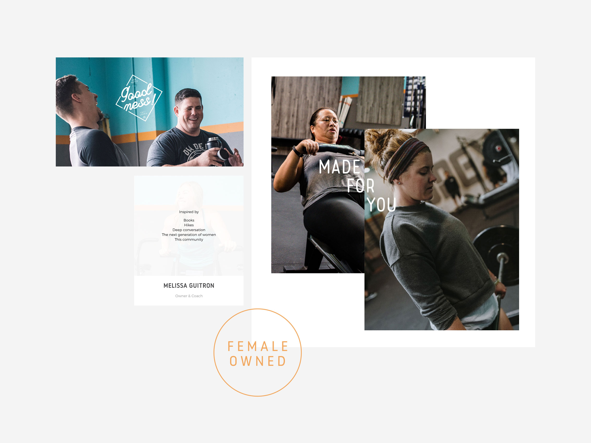
A clean website with great imagery will get you far, but for KURA it was important that the personality and attitude came through all the way.
Subtle details were added throughout the site that communicate the vibe that makes KURA special. The coaches share their inspirations, while the badges throughout tell the story of what KURA is all about.
The process
I love working with Melissa because we push each other creatively. No idea is too crazy, and it’s not uncommon for either of us to wake up to an inbox full of ideas to take KURA’s brand to the next level.
When we worked on the OPEX KURA brand, we knew that eventually the website would get its own refresh.
Since we’re on opposite sides of the world, we have regular Zoom meetings that make us feel like we’re in the same room. We used Dropbox Paper to keep our Project Plan in one place, making it easy to share feedback without anything getting lost in emails.
The outcome
The people who currently train at KURA say that the new site is the closest you can get to being at the gym while sitting in front of a screen. It’s been an ice-breaker with other local business owners, who are grateful to be featured in KURA’s healthy neighborhood.
Most importantly, the site saw an increase in both the number and the quality of leads, connecting OPEX KURA to their ideal audience.
Boris is a visionary. He is the resourceful, kind and super talented force behind the OPEX KURA brand. He takes our outlandish and big ideas and makes them real.
He is the warm smile at the other end of the world who we trust with everything design, and we’re not the only ones. In our circle, he’s almost everyone’s go-to for brand development for one simple reason: his work is just so good.
From brand concept to merchandise design to an awesome website, working with Boris and Metcon Creative to brand your business is a no-brainer.
Melissa Guitron, Owner, OPEX KURA
More good work for good people
